
3 2 | DESCRIPTIVE STATISTICS

Figure 2.1 When you have large amounts of data, you will need to organize it in a way that makes sense. These ballots from an election are rolled together with similar ballots to keep them organized. (credit: William Greeson)
Introduction
Once you have collected data, what will you do with it? Data can be described and presented in many different formats. For example, suppose you are interested in buying a house in a particular area. You may have no clue about the house prices, so you might ask your real estate agent to give you a sample data set of prices. Looking at all the prices in the sample often is overwhelming. A better way might be to look at the median price and the variation of prices. The median and variation are just two ways that you will learn to describe data. Your agent might also provide you with a graph of the data.
In this chapter, you will study numerical and graphical ways to describe and display your data. This area of statistics is called “Descriptive Statistics.” You will learn how to calculate, and even more importantly, how to interpret these measurements and graphs.
A statistical graph is a tool that helps you learn about the shape or distribution of a sample or a population. A graph can be a more effective way of presenting data than a mass of numbers because we can see where data clusters and where there are only a few data values. Newspapers and the Internet use graphs to show trends and to enable readers to compare facts and figures quickly. Statisticians often graph data first to get a picture of the data. Then, more formal tools may be applied.
Some of the types of graphs that are used to summarize and organize data are the dot plot, the bar graph, the histogram, the stem-and-leaf plot, the frequency polygon (a type of broken line graph), the pie chart, and the box plot. In this chapter, we
will briefly look at stem-and-leaf plots, line graphs, and bar graphs, as well as frequency polygons, and time series graphs. Our emphasis will be on histograms and box plots.
| Display Data
Stem-and-Leaf Graphs (Stemplots), Line Graphs, and Bar Graphs
Example 2.1For Susan Dean’s spring pre-calculus class, scores for the first exam were as follows (smallest to largest):33; 42; 49; 49; 53; 55; 55; 61; 63; 67; 68; 68; 69; 69; 72; 73; 74; 78; 80; 83; 88; 88; 88; 90; 92; 94; 94; 94; 94;96; 100Table 2.1 Stem-and- Leaf GraphThe stemplot shows that most scores fell in the 60s, 70s, 80s, and 90s. Eight out of the 31 scores or approximately26% ⎛ 8 ⎞ were in the 90s or 100, a fairly high number of As.⎝31⎠
One simple graph, the stem-and-leaf graph or stemplot, comes from the field of exploratory data analysis. It is a good choice when the data sets are small. To create the plot, divide each observation of data into a stem and a leaf. The leaf consists of a final significant digit. For example, 23 has stem two and leaf three. The number 432 has stem 43 and leaf two. Likewise, the number 5,432 has stem 543 and leaf two. The decimal 9.3 has stem nine and leaf three. Write the stems in a vertical line from smallest to largest. Draw a vertical line to the right of the stems. Then write the leaves in increasing order next to their corresponding stem.
|
Stem |
Leaf |
|
3 |
3 |
|
4 |
2 9 9 |
|
5 |
3 5 5 |
|
6 |
1 3 7 8 8 9 9 |
|
7 |
2 3 4 8 |
|
8 |
0 3 8 8 8 |
|
9 |
0 2 4 4 4 4 6 |
|
10 |
0 |
2.1 For the Park City basketball team, scores for the last 30 games were as follows (smallest to largest):32; 32; 33; 34; 38; 40; 42; 42; 43; 44; 46; 47; 47; 48; 48; 48; 49; 50; 50; 51; 52; 52; 52; 53; 54; 56; 57; 57; 60; 61Construct a stem plot for the data.
The stemplot is a quick way to graph data and gives an exact picture of the data. You want to look for an overall pattern and any outliers. An outlier is an observation of data that does not fit the rest of the data. It is sometimes called an extreme value. When you graph an outlier, it will appear not to fit the pattern of the graph. Some outliers are due to mistakes (for example, writing down 50 instead of 500) while others may indicate that something unusual is happening. It takes some background information to explain outliers, so we will cover them in more detail later.
This OpenStax book is available for free at http://cnx.org/content/col11776/1.33
Example 2.2The data are the distances (in kilometers) from a home to local supermarkets. Create a stemplot using the data: 1.1; 1.5; 2.3; 2.5; 2.7; 3.2; 3.3; 3.3; 3.5; 3.8; 4.0; 4.2; 4.5; 4.5; 4.7; 4.8; 5.5; 5.6; 6.5; 6.7; 12.3Do the data seem to have any concentration of values?Solution 2.2The value 12.3 may be an outlier. Values appear to concentrate at three and four kilometers.Table 2.2NOTEThe leaves are to the right of the decimal.
|
Stem |
Leaf |
|
1 |
1 5 |
|
2 |
3 5 7 |
|
3 |
2 3 3 5 8 |
|
4 |
0 2 5 5 7 8 |
|
5 |
5 6 |
|
6 |
5 7 |
|
7 |
|
|
8 |
|
|
9 |
|
|
10 |
|
|
11 |
|
|
12 |
3 |
2.2 The following data show the distances (in miles) from the homes of off-campus statistics students to the college. Create a stem plot using the data and identify any outliers:0.5; 0.7; 1.1; 1.2; 1.2; 1.3; 1.3; 1.5; 1.5; 1.7; 1.7; 1.8; 1.9; 2.0; 2.2; 2.5; 2.6; 2.8; 2.8; 2.8; 3.5; 3.8; 4.4; 4.8; 4.9; 5.2;5.5; 5.7; 5.8; 8.0
Example 2.3A side-by-side stem-and-leaf plot allows a comparison of the two data sets in two columns. In a side-by-side stem-and-leaf plot, two sets of leaves share the same stem. The leaves are to the left and the right of the stems. Table 2.4 and Table 2.5 show the ages of presidents at their inauguration and at their death. Construct a side- by-side stem-and-leaf plot using this data.
Solution 2.3
|
Ages at Inauguration |
|
Ages at Death |
|
9 9 8 7 7 7 6 3 2 |
4 |
6 9 |
|
8 7 7 7 7 6 6 6 5 5 5 5 4 4 4 4 4 2 2 1 1 1 1 1 0 |
5 |
3 6 6 7 7 8 |
|
9 8 5 4 4 2 1 1 1 0 |
6 |
0 0 3 3 4 4 5 6 7 7 7 8 |
|
|
7 |
0 0 1 1 1 4 7 8 8 9 |
|
|
8 |
0 1 3 5 8 |
|
|
9 |
0 0 3 3 |
Table 2.3
|
Age |
President |
Age |
President |
Age |
|
|
Washington |
57 |
Lincoln |
52 |
Hoover |
54 |
|
J. Adams |
61 |
A. Johnson |
56 |
F. Roosevelt |
51 |
|
Jefferson |
57 |
Grant |
46 |
Truman |
60 |
|
Madison |
57 |
Hayes |
54 |
Eisenhower |
62 |
|
Monroe |
58 |
Garfield |
49 |
Kennedy |
43 |
|
J. Q. Adams |
57 |
Arthur |
51 |
L. Johnson |
55 |
|
Jackson |
61 |
Cleveland |
47 |
Nixon |
56 |
|
Van Buren |
54 |
B. Harrison |
55 |
Ford |
61 |
|
W. H. Harrison |
68 |
Cleveland |
55 |
Carter |
52 |
|
Tyler |
51 |
McKinley |
54 |
Reagan |
69 |
|
Polk |
49 |
T. Roosevelt |
42 |
G.H.W. Bush |
64 |
|
Taylor |
64 |
Taft |
51 |
Clinton |
47 |
|
Fillmore |
50 |
Wilson |
56 |
G. W. Bush |
54 |
|
Pierce |
48 |
Harding |
55 |
Obama |
47 |
|
Buchanan |
65 |
Coolidge |
51 |
|
|
Table 2.4 Presidential Ages at Inauguration
|
Age |
President |
Age |
President |
Age |
|
|
Washington |
67 |
Lincoln |
56 |
Hoover |
90 |
|
J. Adams |
90 |
A. Johnson |
66 |
F. Roosevelt |
63 |
|
Jefferson |
83 |
Grant |
63 |
Truman |
88 |
|
Madison |
85 |
Hayes |
70 |
Eisenhower |
78 |
|
Monroe |
73 |
Garfield |
49 |
Kennedy |
46 |
Table 2.5 Presidential Age at Death
This OpenStax book is available for free at http://cnx.org/content/col11776/1.33
|
President |
Age |
President |
Age |
President |
Age |
|
J. Q. Adams |
80 |
Arthur |
56 |
L. Johnson |
64 |
|
Jackson |
78 |
Cleveland |
71 |
Nixon |
81 |
|
Van Buren |
79 |
B. Harrison |
67 |
Ford |
93 |
|
W. H. Harrison |
68 |
Cleveland |
71 |
Reagan |
93 |
|
Tyler |
71 |
McKinley |
58 |
|
|
|
Polk |
53 |
T. Roosevelt |
60 |
|
|
|
Taylor |
65 |
Taft |
72 |
|
|
|
Fillmore |
74 |
Wilson |
67 |
|
|
|
Pierce |
64 |
Harding |
57 |
|
|
|
Buchanan |
77 |
Coolidge |
60 |
|
|
Table 2.5 Presidential Age at Death
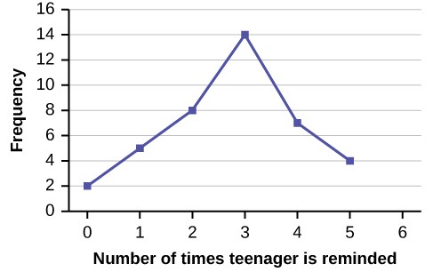
Example 2.4In a survey, 40 mothers were asked how many times per week a teenager must be reminded to do his or her chores. The results are shown in Table 2.6 and in Figure 2.2.Table 2.6
Another type of graph that is useful for specific data values is a line graph. In the particular line graph shown in Example 2.4, the x-axis (horizontal axis) consists of data values and the y-axis (vertical axis) consists of frequency points. The frequency points are connected using line segments.
2.4 In a survey, 40 people were asked how many times per year they had their car in the shop for repairs. The results are shown in Table 2.7. Construct a line graph.Table 2.7
Bar graphs consist of bars that are separated from each other. The bars can be rectangles or they can be rectangular boxes (used in three-dimensional plots), and they can be vertical or horizontal. The bar graph shown in Example 2.5 has age groups represented on the x-axis and proportions on the y-axis.
This OpenStax book is available for free at http://cnx.org/content/col11776/1.33
Example 2.5By the end of 2011, Facebook had over 146 million users in the United States. Table 2.7 shows three age groups, the number of users in each age group, and the proportion (%) of users in each age group. Construct a bar graph using this data.Table 2.8Solution 2.5Figure 2.3
|
Number of Facebook users |
Proportion (%) of Facebook users |
|
|
13–25 |
65,082,280 |
45% |
|
26–44 |
53,300,200 |
36% |
|
45–64 |
27,885,100 |
19% |
2.5 The population in Park City is made up of children, working-age adults, and retirees. Table 2.9 shows the three age groups, the number of people in the town from each age group, and the proportion (%) of people in each age group. Construct a bar graph showing the proportions.Table 2.9
Example 2.6The columns in Table 2.9 contain: the race or ethnicity of students in U.S. Public Schools for the class of 2011, percentages for the Advanced Placement examine population for that class, and percentages for the overall student population. Create a bar graph with the student race or ethnicity (qualitative data) on the x-axis, and the Advanced Placement examinee population percentages on the y-axis.Table 2.10
|
Number of people |
Proportion of population |
|
|
Children |
67,059 |
19% |
|
Working-age adults |
152,198 |
43% |
|
Retirees |
131,662 |
38% |
|
AP Examinee Population |
Overall Student Population |
|
|
1 = Asian, Asian American or Pacific Islander |
10.3% |
5.7% |
|
2 = Black or African American |
9.0% |
14.7% |
|
3 = Hispanic or Latino |
17.0% |
17.6% |
|
4 = American Indian or Alaska Native |
0.6% |
1.1% |
|
5 = White |
57.1% |
59.2% |
|
6 = Not reported/other |
6.0% |
1.7% |
This OpenStax book is available for free at http://cnx.org/content/col11776/1.33
2.6 Park city is broken down into six voting districts. The table shows the percent of the total registered voter population that lives in each district as well as the percent total of the entire population that lives in each district. Construct a bar graph that shows the registered voter population by district.Table 2.11
Solution 2.6
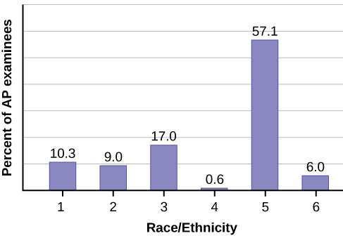
Figure 2.4
|
District |
Registered voter population |
Overall city population |
|
1 |
15.5% |
19.4% |
|
2 |
12.2% |
15.6% |
|
3 |
9.8% |
9.0% |
|
4 |
17.4% |
18.5% |
|
5 |
22.8% |
20.7% |
|
6 |
22.3% |
16.8% |
|
|
Dogs |
Cats |
Fish |
Total |
|
Men |
4 |
2 |
2 |
8 |
|
Women |
4 |
6 |
2 |
12 |
|
Total |
8 |
8 |
4 |
20 |
Example 2.7Below is a two-way table showing the types of pets owned by men and women:Table 2.12Given these data, calculate the conditional distributions for the subpopulation of men who own each pet type.Solution 2.7Men who own dogs = 4/8 = 0.5 Men who own cats = 2/8 = 0.25 Men who own fish = 2/8 = 0.25Note: The sum of all of the conditional distributions must equal one. In this case, 0.5 + 0.25 + 0.25 = 1; therefore, the solution “checks”.
Histograms, Frequency Polygons, and Time Series Graphs
For most of the work you do in this book, you will use a histogram to display the data. One advantage of a histogram is that it can readily display large data sets. A rule of thumb is to use a histogram when the data set consists of 100 values or more.
A histogram consists of contiguous (adjoining) boxes. It has both a horizontal axis and a vertical axis. The horizontal axis is labeled with what the data represents (for instance, distance from your home to school). The vertical axis is labeled either frequency or relative frequency (or percent frequency or probability). The graph will have the same shape with either label. The histogram (like the stemplot) can give you the shape of the data, the center, and the spread of the data.
The relative frequency is equal to the frequency for an observed value of the data divided by the total number of data values in the sample.(Remember, frequency is defined as the number of times an answer occurs.) If:
- f = frequency
- n = total number of data values (or the sum of the individual frequencies), and
- RF = relative frequency, then:
n
RF = f
For example, if three students in Mr. Ahab’s English class of 40 students received from 90% to 100%, then, f = 3, n = 40,
n
and RF = f
= 3 40
= 0.075. 7.5% of the students received 90–100%. 90–100% are quantitative measures.
To construct a histogram, first decide how many bars or intervals, also called classes, represent the data. Many histograms consist of five to 15 bars or classes for clarity. The number of bars needs to be chosen. Choose a starting point for the first interval to be less than the smallest data value. A convenient starting point is a lower value carried out to one more decimal place than the value with the most decimal places. For example, if the value with the most decimal places is
6.1 and this is the smallest value, a convenient starting point is 6.05 (6.1 – 0.05 = 6.05). We say that 6.05 has more precision. If the value with the most decimal places is 2.23 and the lowest value is 1.5, a convenient starting point is 1.495 (1.5 – 0.005
= 1.495). If the value with the most decimal places is 3.234 and the lowest value is 1.0, a convenient starting point is 0.9995 (1.0 – 0.0005 = 0.9995). If all the data happen to be integers and the smallest value is two, then a convenient starting point is 1.5 (2 – 0.5 = 1.5). Also, when the starting point and other boundaries are carried to one additional decimal place, no data
This OpenStax book is available for free at http://cnx.org/content/col11776/1.33
value will fall on a boundary. The next two examples go into detail about how to construct a histogram using continuous data and how to create a histogram using discrete data.
Example 2.8
The following data are the heights (in inches to the nearest half inch) of 100 male semiprofessional soccer players. The heights are continuous data, since height is measured.
60; 60.5; 61; 61; 61.5
63.5; 63.5; 63.5
64; 64; 64; 64; 64; 64; 64; 64.5; 64.5; 64.5; 64.5; 64.5; 64.5; 64.5; 64.5
66; 66; 66; 66; 66; 66; 66; 66; 66; 66; 66.5; 66.5; 66.5; 66.5; 66.5; 66.5; 66.5; 66.5; 66.5; 66.5; 66.5; 67; 67; 67;
67; 67; 67; 67; 67; 67; 67; 67; 67; 67.5; 67.5; 67.5; 67.5; 67.5; 67.5; 67.5
68; 68; 69; 69; 69; 69; 69; 69; 69; 69; 69; 69; 69.5; 69.5; 69.5; 69.5; 69.5
70; 70; 70; 70; 70; 70; 70.5; 70.5; 70.5; 71; 71; 71
72; 72; 72; 72.5; 72.5; 73; 73.5
74
The smallest data value is 60. Since the data with the most decimal places has one decimal (for instance, 61.5), we want our starting point to have two decimal places. Since the numbers 0.5, 0.05, 0.005, etc. are convenient numbers, use 0.05 and subtract it from 60, the smallest value, for the convenient starting point.
60 – 0.05 = 59.95 which is more precise than, say, 61.5 by one decimal place. The starting point is, then, 59.95. The largest value is 74, so 74 + 0.05 = 74.05 is the ending value.
Next, calculate the width of each bar or class interval. To calculate this width, subtract the starting point from the ending value and divide by the number of bars (you must choose the number of bars you desire). Suppose you choose eight bars.
NOTEWe will round up to two and make each bar or class interval two units wide. Rounding up to two is one way to prevent a value from falling on a boundary. Rounding to the next number is often necessary even if it goes against the standard rules of rounding. For this example, using 1.76 as the width would also work. A guideline that is followed by some for the width of a bar or class interval is to take the square root of the number of data values and then round to the nearest whole number, if necessary. For example, if there are 150 values of data, take the square root of 150 and round to 12 bars or intervals.
8
74.05 − 59.95 = 1.76
The boundaries are:
• 59.95
• 59.95 + 2 = 61.95
• 61.95 + 2 = 63.95
• 63.95 + 2 = 65.95
• 65.95 + 2 = 67.95
• 67.95 + 2 = 69.95
• 69.95 + 2 = 71.95
• 71.95 + 2 = 73.95
• 73.95 + 2 = 75.95
The heights 60 through 61.5 inches are in the interval 59.95–61.95. The heights that are 63.5 are in the interval 61.95–63.95. The heights that are 64 through 64.5 are in the interval 63.95–65.95. The heights 66 through 67.5 are in the interval 65.95–67.95. The heights 68 through 69.5 are in the interval 67.95–69.95. The heights 70 through 71 are in the interval 69.95–71.95. The heights 72 through 73.5 are in the interval 71.95–73.95. The height 74 is
in the interval 73.95–75.95.
The following histogram displays the heights on the x-axis and relative frequency on the y-axis.
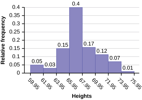
Figure 2.5
2.8 The following data are the shoe sizes of 50 male students. The sizes are continuous data since shoe size is measured. Construct a histogram and calculate the width of each bar or class interval. Suppose you choose six bars.9; 9; 9.5; 9.5; 10; 10; 10; 10; 10; 10; 10.5; 10.5; 10.5; 10.5; 10.5; 10.5; 10.5; 10.511; 11; 11; 11; 11; 11; 11; 11; 11; 11; 11; 11; 11; 11.5; 11.5; 11.5; 11.5; 11.5; 11.5; 11.512; 12; 12; 12; 12; 12; 12; 12.5; 12.5; 12.5; 12.5; 14
Example 2.9Create a histogram for the following data: the number of books bought by 50 part-time college students at ABC College. The number of books is discrete data, since books are counted.1; 1; 1; 1; 1; 1; 1; 1; 1; 1; 12; 2; 2; 2; 2; 2; 2; 2; 2; 23; 3; 3; 3; 3; 3; 3; 3; 3; 3; 3; 3; 3; 3; 3; 34; 4; 4; 4; 4; 45; 5; 5; 5; 56; 6Eleven students buy one book. Ten students buy two books. Sixteen students buy three books. Six students buy four books. Five students buy five books. Two students buy six books.Because the data are integers, subtract 0.5 from 1, the smallest data value and add 0.5 to 6, the largest data value. Then the starting point is 0.5 and the ending value is 6.5.Next, calculate the width of each bar or class interval. If the data are discrete and there are not too many different values, a width that places the data values in the middle of the bar or class interval is the most convenient. Since the data consist of the numbers 1, 2, 3, 4, 5, 6, and the starting point is 0.5, a width of one places the 1 in the middle of the interval from 0.5 to 1.5, the 2 in the middle of the interval from 1.5 to 2.5, the 3 in the middle of the interval from 2.5 to 3.5, the 4 in the middle of the interval from to , the 5 in the middle of the interval from to , and the in the middle of the interval from to .
This OpenStax book is available for free at http://cnx.org/content/col11776/1.33
Solution 2.9
• 3.5 to 4.5
• 4.5 to 5.5
• 6
• 5.5 to 6.5
Calculate the number of bars as follows:
= 1
6.5 − 0.5
number of bars
Example 2.10Using this data set, construct a histogram.Table 2.13
where 1 is the width of a bar. Therefore, bars = 6.
The following histogram displays the number of books on the x-axis and the frequency on the y-axis.
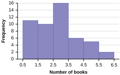
Figure 2.6
|
Number of Hours My Classmates Spent Playing Video Games on Weekends |
||||
|
9.95 |
10 |
2.25 |
16.75 |
0 |
|
19.5 |
22.5 |
7.5 |
15 |
12.75 |
|
5.5 |
11 |
10 |
20.75 |
17.5 |
|
23 |
21.9 |
24 |
23.75 |
18 |
|
20 |
15 |
22.9 |
18.8 |
20.5 |
Solution 2.10
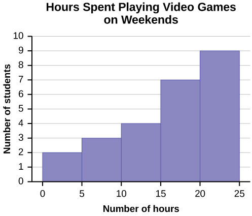
Figure 2.7
Some values in this data set fall on boundaries for the class intervals. A value is counted in a class interval if it falls on the left boundary, but not if it falls on the right boundary. Different researchers may set up histograms for the same data in different ways. There is more than one correct way to set up a histogram.
Frequency Polygons
Frequency polygons are analogous to line graphs, and just as line graphs make continuous data visually easy to interpret, so too do frequency polygons.
To construct a frequency polygon, first examine the data and decide on the number of intervals, or class intervals, to use on the x-axis and y-axis. After choosing the appropriate ranges, begin plotting the data points. After all the points are plotted, draw line segments to connect them.
This OpenStax book is available for free at http://cnx.org/content/col11776/1.33
A frequency polygon was constructed from the frequency table below.
|
Frequency Distribution for Calculus Final Test Scores |
|||
|
Lower Bound |
Upper Bound |
Frequency |
Cumulative Frequency |
|
49.5 |
59.5 |
5 |
5 |
|
59.5 |
69.5 |
10 |
15 |
|
69.5 |
79.5 |
30 |
45 |
|
79.5 |
89.5 |
40 |
85 |
|
89.5 |
99.5 |
15 |
100 |
Table 2.14
Figure 2.8
The first label on the x-axis is 44.5. This represents an interval extending from 39.5 to 49.5. Since the lowest test score is 54.5, this interval is used only to allow the graph to touch the x-axis. The point labeled 54.5 represents the next interval, or the first “real” interval from the table, and contains five scores. This reasoning is followed for each of the remaining intervals with the point 104.5 representing the interval from 99.5 to 109.5. Again, this interval contains no data and is only used so that the graph will touch the x-axis. Looking at the graph, we say that this distribution is skewed because one side of the graph does not mirror the other side.
2.11 Construct a frequency polygon of U.S. Presidents’ ages at inauguration shown in Table 2.15.
|
Frequency |
|
|
41.5–46.5 |
4 |
|
46.5–51.5 |
11 |
|
51.5–56.5 |
14 |
|
56.5–61.5 |
9 |
|
61.5–66.5 |
4 |
|
66.5–71.5 |
2 |
Table 2.15
Example 2.12We will construct an overlay frequency polygon comparing the scores from Example 2.11 with the students’ final numeric grade.Table 2.16Table 2.17
Frequency polygons are useful for comparing distributions. This is achieved by overlaying the frequency polygons drawn for different data sets.
|
Frequency Distribution for Calculus Final Test Scores |
|||
|
Lower Bound |
Upper Bound |
Frequency |
Cumulative Frequency |
|
49.5 |
59.5 |
5 |
5 |
|
59.5 |
69.5 |
10 |
15 |
|
69.5 |
79.5 |
30 |
45 |
|
79.5 |
89.5 |
40 |
85 |
|
89.5 |
99.5 |
15 |
100 |
|
Frequency Distribution for Calculus Final Grades |
|||
|
Lower Bound |
Upper Bound |
Frequency |
Cumulative Frequency |
|
49.5 |
59.5 |
10 |
10 |
|
59.5 |
69.5 |
10 |
20 |
|
69.5 |
79.5 |
30 |
50 |
|
79.5 |
89.5 |
45 |
95 |
|
89.5 |
99.5 |
5 |
100 |
This OpenStax book is available for free at http://cnx.org/content/col11776/1.33
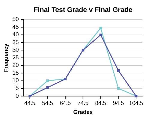
Figure 2.9
Constructing a Time Series Graph
Suppose that we want to study the temperature range of a region for an entire month. Every day at noon we note the temperature and write this down in a log. A variety of statistical studies could be done with these data. We could find the mean or the median temperature for the month. We could construct a histogram displaying the number of days that temperatures reach a certain range of values. However, all of these methods ignore a portion of the data that we have collected.
One feature of the data that we may want to consider is that of time. Since each date is paired with the temperature reading for the day, we don‘t have to think of the data as being random. We can instead use the times given to impose a chronological order on the data. A graph that recognizes this ordering and displays the changing temperature as the month progresses is called a time series graph.
To construct a time series graph, we must look at both pieces of our paired data set. We start with a standard Cartesian coordinate system. The horizontal axis is used to plot the date or time increments, and the vertical axis is used to plot the values of the variable that we are measuring. By doing this, we make each point on the graph correspond to a date and a measured quantity. The points on the graph are typically connected by straight lines in the order in which they occur.
Example 2.13
The following data shows the Annual Consumer Price Index, each month, for ten years. Construct a time series graph for the Annual Consumer Price Index data only.
|
Year |
Jan |
Feb |
Mar |
Apr |
May |
Jun |
Jul |
|
2003 |
181.7 |
183.1 |
184.2 |
183.8 |
183.5 |
183.7 |
183.9 |
|
2004 |
185.2 |
186.2 |
187.4 |
188.0 |
189.1 |
189.7 |
189.4 |
|
2005 |
190.7 |
191.8 |
193.3 |
194.6 |
194.4 |
194.5 |
195.4 |
|
2006 |
198.3 |
198.7 |
199.8 |
201.5 |
202.5 |
202.9 |
203.5 |
|
2007 |
202.416 |
203.499 |
205.352 |
206.686 |
207.949 |
208.352 |
208.299 |
|
2008 |
211.080 |
211.693 |
213.528 |
214.823 |
216.632 |
218.815 |
219.964 |
|
2009 |
211.143 |
212.193 |
212.709 |
213.240 |
213.856 |
215.693 |
215.351 |
|
2010 |
216.687 |
216.741 |
217.631 |
218.009 |
218.178 |
217.965 |
218.011 |
|
2011 |
220.223 |
221.309 |
223.467 |
224.906 |
225.964 |
225.722 |
225.922 |
|
2012 |
226.665 |
227.663 |
229.392 |
230.085 |
229.815 |
229.478 |
229.104 |
Table 2.18
|
Year |
Aug |
Sep |
Oct |
Nov |
Dec |
Annual |
|
2003 |
184.6 |
185.2 |
185.0 |
184.5 |
184.3 |
184.0 |
|
2004 |
189.5 |
189.9 |
190.9 |
191.0 |
190.3 |
188.9 |
|
2005 |
196.4 |
198.8 |
199.2 |
197.6 |
196.8 |
195.3 |
|
2006 |
203.9 |
202.9 |
201.8 |
201.5 |
201.8 |
201.6 |
|
2007 |
207.917 |
208.490 |
208.936 |
210.177 |
210.036 |
207.342 |
|
2008 |
219.086 |
218.783 |
216.573 |
212.425 |
210.228 |
215.303 |
|
2009 |
215.834 |
215.969 |
216.177 |
216.330 |
215.949 |
214.537 |
|
2010 |
218.312 |
218.439 |
218.711 |
218.803 |
219.179 |
218.056 |
|
2011 |
226.545 |
226.889 |
226.421 |
226.230 |
225.672 |
224.939 |
|
2012 |
230.379 |
231.407 |
231.317 |
230.221 |
229.601 |
229.594 |
Table 2.19
This OpenStax book is available for free at http://cnx.org/content/col11776/1.33
Solution 2.13
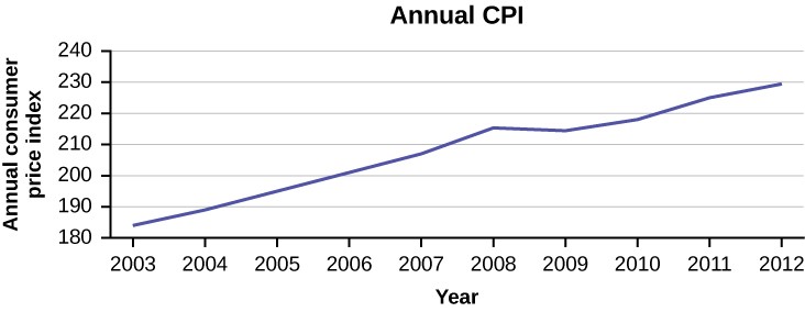
Figure 2.10
|
CO2 Emissions |
|||
|
|
Ukraine |
United Kingdom |
United States |
|
2003 |
352,259 |
540,640 |
5,681,664 |
|
2004 |
343,121 |
540,409 |
5,790,761 |
|
2005 |
339,029 |
541,990 |
5,826,394 |
|
2006 |
327,797 |
542,045 |
5,737,615 |
|
2007 |
328,357 |
528,631 |
5,828,697 |
|
2008 |
323,657 |
522,247 |
5,656,839 |
|
2009 |
272,176 |
474,579 |
5,299,563 |
2.13 The following table is a portion of a data set from www.worldbank.org. Use the table to construct a time series graph for CO2 emissions for the United States.Table 2.20
Uses of a Time Series Graph
Time series graphs are important tools in various applications of statistics. When recording values of the same variable over an extended period of time, sometimes it is difficult to discern any trend or pattern. However, once the same data points are displayed graphically, some features jump out. Time series graphs make trends easy to spot.
How NOT to Lie with Statistics
It is important to remember that the very reason we develop a variety of methods to present data is to develop insights into the subject of what the observations represent. We want to get a “sense” of the data. Are the observations all very much alike or are they spread across a wide range of values, are they bunched at one end of the spectrum or are they distributed evenly and so on. We are trying to get a visual picture of the numerical data. Shortly we will develop formal mathematical measures of the data, but our visual graphical presentation can say much. It can, unfortunately, also say much that is distracting, confusing and simply wrong in terms of the impression the visual leaves. Many years ago Darrell Huff wrote the book How to Lie with Statistics. It has been through 25 plus printings and sold more than one and one-half million copies. His perspective was a harsh one and used many actual examples that were designed to mislead. He wanted to make people
aware of such deception, but perhaps more importantly to educate so that others do not make the same errors inadvertently.
Again, the goal is to enlighten with visuals that tell the story of the data. Pie charts have a number of common problems when used to convey the message of the data. Too many pieces of the pie overwhelm the reader. More than perhaps five or six categories ought to give an idea of the relative importance of each piece. This is after all the goal of a pie chart, what subset matters most relative to the others. If there are more components than this then perhaps an alternative approach would be better or perhaps some can be consolidated into an “other” category. Pie charts cannot show changes over time, although we see this attempted all too often. In federal, state, and city finance documents pie charts are often presented to show the components of revenue available to the governing body for appropriation: income tax, sales tax motor vehicle taxes and so on. In and of itself this is interesting information and can be nicely done with a pie chart. The error occurs when two years are set side-by-side. Because the total revenues change year to year, but the size of the pie is fixed, no real information is provided and the relative size of each piece of the pie cannot be meaningfully compared.
Histograms can be very helpful in understanding the data. Properly presented, they can be a quick visual way to present probabilities of different categories by the simple visual of comparing relative areas in each category. Here the error, purposeful or not, is to vary the width of the categories. This of course makes comparison to the other categories impossible. It does embellish the importance of the category with the expanded width because it has a greater area, inappropriately, and thus visually “says” that that category has a higher probability of occurrence.
Time series graphs perhaps are the most abused. A plot of some variable across time should never be presented on axes that change part way across the page either in the vertical or horizontal dimension. Perhaps the time frame is changed from years to months. Perhaps this is to save space or because monthly data was not available for early years. In either case this confounds the presentation and destroys any value of the graph. If this is not done to purposefully confuse the reader, then it certainly is either lazy or sloppy work.
Changing the units of measurement of the axis can smooth out a drop or accentuate one. If you want to show large changes, then measure the variable in small units, penny rather than thousands of dollars. And of course to continue the fraud, be sure that the axis does not begin at zero, zero. If it begins at zero, zero, then it becomes apparent that the axis has been manipulated.
Perhaps you have a client that is concerned with the volatility of the portfolio you manage. An easy way to present the data is to use long time periods on the time series graph. Use months or better, quarters rather than daily or weekly data. If that doesn’t get the volatility down then spread the time axis relative to the rate of return or portfolio valuation axis. If you want to show “quick” dramatic growth, then shrink the time axis. Any positive growth will show visually “high” growth rates. Do note that if the growth is negative then this trick will show the portfolio is collapsing at a dramatic rate.
Again, the goal of descriptive statistics is to convey meaningful visuals that tell the story of the data. Purposeful manipulation is fraud and unethical at the worst, but even at its best, making these type of errors will lead to confusion on the part of the analysis.
| Measures of the Location of the Data
The common measures of location are quartiles and percentiles
Quartiles are special percentiles. The first quartile, Q1, is the same as the 25th percentile, and the third quartile, Q3, is the same as the 75th percentile. The median, M, is called both the second quartile and the 50th percentile.
To calculate quartiles and percentiles, the data must be ordered from smallest to largest. Quartiles divide ordered data into quarters. Percentiles divide ordered data into hundredths. To score in the 90th percentile of an exam does not mean, necessarily, that you received 90% on a test. It means that 90% of test scores are the same or less than your score and 10% of the test scores are the same or greater than your test score.
Percentiles are useful for comparing values. For this reason, universities and colleges use percentiles extensively. One instance in which colleges and universities use percentiles is when SAT results are used to determine a minimum testing score that will be used as an acceptance factor. For example, suppose Duke accepts SAT scores at or above the 75th percentile. That translates into a score of at least 1220.
Percentiles are mostly used with very large populations. Therefore, if you were to say that 90% of the test scores are less (and not the same or less) than your score, it would be acceptable because removing one particular data value is not significant.
The median is a number that measures the “center” of the data. You can think of the median as the “middle value,” but it does not actually have to be one of the observed values. It is a number that separates ordered data into halves. Half the values are the same number or smaller than the median, and half the values are the same number or larger. For example, consider the following data.
This OpenStax book is available for free at http://cnx.org/content/col11776/1.33
1; 11.5; 6; 7.2; 4; 8; 9; 10; 6.8; 8.3; 2; 2; 10; 1
Ordered from smallest to largest:
1; 1; 2; 2; 4; 6; 6.8; 7.2; 8; 8.3; 9; 10; 10; 11.5
Since there are 14 observations, the median is between the seventh value, 6.8, and the eighth value, 7.2. To find the median, add the two values together and divide by two.
2
6.8 + 7.2 = 7
The median is seven. Half of the values are smaller than seven and half of the values are larger than seven.
Quartiles are numbers that separate the data into quarters. Quartiles may or may not be part of the data. To find the quartiles, first find the median or second quartile. The first quartile, Q1, is the middle value of the lower half of the data, and the third quartile, Q3, is the middle value, or median, of the upper half of the data. To get the idea, consider the same data set:
1; 1; 2; 2; 4; 6; 6.8; 7.2; 8; 8.3; 9; 10; 10; 11.5
The median or second quartile is seven. The lower half of the data are 1, 1, 2, 2, 4, 6, 6.8. The middle value of the lower half is two.
1; 1; 2; 2; 4; 6; 6.8
The number two, which is part of the data, is the first quartile. One-fourth of the entire sets of values are the same as or less than two and three-fourths of the values are more than two.
The upper half of the data is 7.2, 8, 8.3, 9, 10, 10, 11.5. The middle value of the upper half is nine.
The third quartile, Q3, is nine. Three-fourths (75%) of the ordered data set are less than nine. One-fourth (25%) of the ordered data set are greater than nine. The third quartile is part of the data set in this example.
The interquartile range is a number that indicates the spread of the middle half or the middle 50% of the data. It is the difference between the third quartile (Q3) and the first quartile (Q1).
IQR = Q3 – Q1
NOTEA potential outlier is a data point that is significantly different from the other data points. These special data points may be errors or some kind of abnormality or they may be a key to understanding the data.
Example 2.14For the following 13 real estate prices, calculate the IQR and determine if any prices are potential outliers. Prices are in dollars.389,950; 230,500; 158,000; 479,000; 639,000; 114,950; 5,500,000; 387,000; 659,000; 529,000; 575,000;488,800; 1,095,000Solution 2.14Order the data from smallest to largest.114,950; 158,000; 230,500; 387,000; 389,950; 479,000; 488,800; 529,000; 575,000; 639,000; 659,000;1,095,000; 5,500,000M = 488,800Q1 =230,500 + 387,0002639,000 + 659,0002= 308,750Q3 == 649,000IQR = 649,000 – 308,750 = 340,250
The IQR can help to determine potential outliers. A value is suspected to be a potential outlier if it is less than (1.5)(IQR) below the first quartile or more than (1.5)(IQR) above the third quartile. Potential outliers always require further investigation.
(1.5)(IQR) = (1.5)(340,250) = 510,375
Q1 – (1.5)(IQR) = 308,750 – 510,375 = –201,625
Q3 + (1.5)(IQR) = 649,000 + 510,375 = 1,159,375
Example 2.15For the two data sets in the test scores example, find the following:The interquartile range. Compare the two interquartile ranges.Any outliers in either set.Solution 2.15The five number summary for the day and night classes isTable 2.21The IQR for the day group is Q3 – Q1 = 82.5 – 56 = 26.5 The IQR for the night group is Q3 – Q1 = 89 – 78 = 11The interquartile range (the spread or variability) for the day class is larger than the night class IQR. This suggests more variation will be found in the day class’s class test scores.Day class outliers are found using the IQR times 1.5 rule. So,Q1 – IQR(1.5) = 56 – 26.5(1.5) = 16.25Q3 + IQR(1.5) = 82.5 + 26.5(1.5) = 122.25Since the minimum and maximum values for the day class are greater than 16.25 and less than 122.25, there are no outliers.Night class outliers are calculated as:Q1 – IQR (1.5) = 78 – 11(1.5) = 61.5Q3 + IQR(1.5) = 89 + 11(1.5) = 105.5For this class, any test score less than 61.5 is an outlier. Therefore, the scores of 45 and 25.5 are outliers. Since no test score is greater than 105.5, there is no upper end outlier.
No house price is less than –201,625. However, 5,500,000 is more than 1,159,375. Therefore, 5,500,000 is a potential outlier.
|
|
Minimum |
Q1 |
Median |
Q3 |
Maximum |
|
Day |
32 |
56 |
74.5 |
82.5 |
99 |
|
Night |
25.5 |
78 |
81 |
89 |
98 |
Example 2.16Fifty statistics students were asked how much sleep they get per school night (rounded to the nearest hour). The results were:
This OpenStax book is available for free at http://cnx.org/content/col11776/1.33
|
FREQUENCY |
RELATIVE FREQUENCY |
CUMULATIVE RELATIVE FREQUENCY |
|
|
4 |
2 |
0.04 |
0.04 |
|
5 |
5 |
0.10 |
0.14 |
|
6 |
7 |
0.14 |
0.28 |
|
7 |
12 |
0.24 |
0.52 |
|
8 |
14 |
0.28 |
0.80 |
|
9 |
7 |
0.14 |
0.94 |
|
10 |
3 |
0.06 |
1.00 |
Table 2.22
Find the 28th percentile. Notice the 0.28 in the “cumulative relative frequency” column. Twenty-eight percent of 50 data values is 14 values. There are 14 values less than the 28th percentile. They include the two 4s, the five 5s, and the seven 6s. The 28th percentile is between the last six and the first seven. The 28th percentile is 6.5.
Find the median. Look again at the “cumulative relative frequency” column and find 0.52. The median is the 50th percentile or the second quartile. 50% of 50 is 25. There are 25 values less than the median. They include the two 4s, the five 5s, the seven 6s, and eleven of the 7s. The median or 50th percentile is between the 25th, or seven, and 26th, or seven, values. The median is seven.
2.16 Forty bus drivers were asked how many hours they spend each day running their routes (rounded to the nearest hour). Find the 65th percentile.Table 2.23
Find the third quartile. The third quartile is the same as the 75th percentile. You can “eyeball” this answer. If you look at the “cumulative relative frequency” column, you find 0.52 and 0.80. When you have all the fours, fives, sixes and sevens, you have 52% of the data. When you include all the 8s, you have 80% of the data. The 75th percentile, then, must be an eight. Another way to look at the problem is to find 75% of 50, which is 37.5, and round up to 38. The third quartile, Q3, is the 38th value, which is an eight. You can check this answer by counting the values. (There are 37 values below the third quartile and 12 values above.)
|
Amount of time spent on route (hours) |
Frequency |
Relative Frequency |
Cumulative Relative Frequency |
|
2 |
12 |
0.30 |
0.30 |
|
3 |
14 |
0.35 |
0.65 |
|
4 |
10 |
0.25 |
0.90 |
|
5 |
4 |
0.10 |
1.00 |
Example 2.17Using Table 2.22:Find the 80th percentile.Find the 90th percentile.Find the first quartile. What is another name for the first quartile?Solution 2.17Using the data from the frequency table, we have:a. The 80th percentile is between the last eight and the first nine in the table (between the 40th and 41st values).2The 90th percentile will be the 45th data value (location is 0.90(50) = 45) and the 45th data value is nine.Q1 is also the 25th percentile. The 25th percentile location calculation: P25 = 0.25(50) = 12.5 ≈ 13 the 13th data value. Thus, the 25th percentile is six.Therefore, we need to take the mean of the 40th an 41st values. The 80th percentile = 8 + 9 = 8.5
A Formula for Finding the kth Percentile
If you were to do a little research, you would find several formulas for calculating the kth percentile. Here is one of them.
k = the kth percentile. It may or may not be part of the data.
i = the index (ranking or position of a data value)
n = the total number of data points, or observations
- Order the data from smallest to largest.
- 100
Calculate i = k (n + 1) - If i is an integer, then the kth percentile is the data value in the ith position in the ordered set of data.
- If i is not an integer, then round i up and round i down to the nearest integers. Average the two data values in these two positions in the ordered data set. This is easier to understand in an example.
Example 2.18Listed are 29 ages for Academy Award winning best actors in order from smallest to largest.18; 21; 22; 25; 26; 27; 29; 30; 31; 33; 36; 37; 41; 42; 47; 52; 55; 57; 58; 62; 64; 67; 69; 71; 72; 73; 74; 76; 77Find the 70th percentile.Find the 83rd percentile.Solution 2.18a.i =k = 70i = the indexn = 29 k 100(n + 1) = ( 70 )(29 + 1) = 21. Twenty-one is an integer, and the data value in the 21st position in100b.the ordered data set is 64. The 70th percentile is 64 years.k = 83rd percentilei = the indexn = 29
This OpenStax book is available for free at http://cnx.org/content/col11776/1.33
i = k (n + 1) = ) 83
)(29 + 1) = 24.9, which is NOT an integer. Round it down to 24 and up to 25. The
100100
age in the 24th position is 71 and the age in the 25th position is 72. Average 71 and 72. The 83rd percentile is
71.5 years.
2.18 Listed are 29 ages for Academy Award winning best actors in order from smallest to largest.18; 21; 22; 25; 26; 27; 29; 30; 31; 33; 36; 37; 41; 42; 47; 52; 55; 57; 58; 62; 64; 67; 69; 71; 72; 73; 74; 76; 77Calculate the 20th percentile and the 55th percentile.
A Formula for Finding the Percentile of a Value in a Data Set
- Order the data from smallest to largest.
- x = the number of data values counting from the bottom of the data list up to but not including the data value for which you want to find the percentile.
- y = the number of data values equal to the data value for which you want to find the percentile.
- n = the total number of data.
- n
Calculate x + 0.5y (100). Then round to the nearest integer.
Example 2.19Listed are 29 ages for Academy Award winning best actors in order from smallest to largest.18; 21; 22; 25; 26; 27; 29; 30; 31; 33; 36; 37; 41; 42; 47; 52; 55; 57; 58; 62; 64; 67; 69; 71; 72; 73; 74; 76; 77Find the percentile for 58.Find the percentile for 25.Solution 2.19a. Counting from the bottom of the list, there are 18 data values less than 58. There is one value of 58.x = 18 and y = 1. x + 0.5y (100) = 18 + 0.5(1) (100) = 63.80. 58 is the 64th percentile.n29b. Counting from the bottom of the list, there are three data values less than 25. There is one value of 25.x = 3 and y = 1. x + 0.5y (100) = 3 + 0.5(1) (100) = 12.07. Twenty-five is the 12th percentile.n29
Interpreting Percentiles, Quartiles, and Median
A percentile indicates the relative standing of a data value when data are sorted into numerical order from smallest to largest. Percentages of data values are less than or equal to the pth percentile. For example, 15% of data values are less than or equal to the 15th percentile.
- Low percentiles always correspond to lower data values.
- High percentiles always correspond to higher data values.
A percentile may or may not correspond to a value judgment about whether it is “good” or “bad.” The interpretation of whether a certain percentile is “good” or “bad” depends on the context of the situation to which the data applies. In some situations, a low percentile would be considered “good;” in other contexts a high percentile might be considered “good”. In many situations, there is no value judgment that applies.
NOTEWhen writing the interpretation of a percentile in the context of the given data, the sentence should contain the following information.information about the context of the situation being consideredthe data value (value of the variable) that represents the percentilethe percent of individuals or items with data values below the percentilethe percent of individuals or items with data values above the percentile.
Example 2.20On a timed math test, the first quartile for time it took to finish the exam was 35 minutes. Interpret the first quartile in the context of this situation.Solution 2.20Twenty-five percent of students finished the exam in 35 minutes or less.Seventy-five percent of students finished the exam in 35 minutes or more.A low percentile could be considered good, as finishing more quickly on a timed exam is desirable. (If you take too long, you might not be able to finish.)
Example 2.21On a 20 question math test, the 70th percentile for number of correct answers was 16. Interpret the 70th percentile in the context of this situation.Solution 2.21Seventy percent of students answered 16 or fewer questions correctly.Thirty percent of students answered 16 or more questions correctly.A higher percentile could be considered good, as answering more questions correctly is desirable.
2.21 On a 60 point written assignment, the 80th percentile for the number of points earned was 49. Interpret the 80th percentile in the context of this situation.
Example 2.22At a community college, it was found that the 30th percentile of credit units that students are enrolled for is seven units. Interpret the 30th percentile in the context of this situation.Solution 2.22Thirty percent of students are enrolled in seven or fewer credit units.
Understanding how to interpret percentiles properly is important not only when describing data, but also when calculating probabilities in later chapters of this text.
This OpenStax book is available for free at http://cnx.org/content/col11776/1.33
- Seventy percent of students are enrolled in seven or more credit units.
- In this example, there is no “good” or “bad” value judgment associated with a higher or lower percentile. Students attend community college for varied reasons and needs, and their course load varies according to their needs.
Example 2.23
Sharpe Middle School is applying for a grant that will be used to add fitness equipment to the gym. The principal surveyed 15 anonymous students to determine how many minutes a day the students spend exercising. The results from the 15 anonymous students are shown.
0 minutes; 40 minutes; 60 minutes; 30 minutes; 60 minutes
10 minutes; 45 minutes; 30 minutes; 300 minutes; 90 minutes;
30 minutes; 120 minutes; 60 minutes; 0 minutes; 20 minutes Determine the following five values.
Min = 0
Q1 = 20
Med = 40
Q3 = 60
Max = 300
If you were the principal, would you be justified in purchasing new fitness equipment? Since 75% of the students exercise for 60 minutes or less daily, and since the IQR is 40 minutes (60 – 20 = 40), we know that half of the students surveyed exercise between 20 minutes and 60 minutes daily. This seems a reasonable amount of time spent exercising, so the principal would be justified in purchasing the new equipment.
However, the principal needs to be careful. The value 300 appears to be a potential outlier.
Q3 + 1.5(IQR) = 60 + (1.5)(40) = 120.
The value 300 is greater than 120 so it is a potential outlier. If we delete it and calculate the five values, we get the following values:
Min = 0
Q1 = 20
Q3 = 60
Max = 120
We still have 75% of the students exercising for 60 minutes or less daily and half of the students exercising between 20 and 60 minutes a day. However, 15 students is a small sample and the principal should survey more students to be sure of his survey results.
| Measures of the Center of the Data
The “center” of a data set is also a way of describing location. The two most widely used measures of the “center” of the data are the mean (average) and the median. To calculate the mean weight of 50 people, add the 50 weights together and divide by 50. Technically this is the arithmetic mean. We will discuss the geometric mean later. To find the median weight of the 50 people, order the data and find the number that splits the data into two equal parts meaning an equal number of observations on each side. The weight of 25 people are below this weight and 25 people are heavier than this weight. The median is generally a better measure of the center when there are extreme values or outliers because it is not affected by the precise numerical values of the outliers. The mean is the most common measure of the center.
NOTEThe words “mean” and “average” are often used interchangeably. The substitution of one word for the other is common practice. The technical term is “arithmetic mean” and “average” is technically a center location. Formally, the arithmetic mean is called the first moment of the distribution by mathematicians. However, in practice among non- statisticians, “average” is commonly accepted for “arithmetic mean.”
When each value in the data set is not unique, the mean can be calculated by multiplying each distinct value by its frequency and then dividing the sum by the total number of data values. The letter used to represent the sample mean is an x with a
bar over it (pronounced “x bar”): x– .
The Greek letter μ (pronounced “mew”) represents the population mean. One of the requirements for the sample mean to be a good estimate of the population mean is for the sample taken to be truly random.
To see that both ways of calculating the mean are the same, consider the sample: 1; 1; 1; 2; 2; 3; 4; 4; 4; 4; 4
11
x– = 1 + 1 + 1 + 2 + 2 + 3 + 4 + 4 + 4 + 4 + 4 = 2.7
11
–x = 3(1) + 2(2) + 1(3) + 5(4) = 2.7
In the second calculation, the frequencies are 3, 2, 1, and 5.
You can quickly find the location of the median by using the expression n + 1 .
2
The letter n is the total number of data values in the sample. If n is an odd number, the median is the middle value of the ordered data (ordered smallest to largest). If n is an even number, the median is equal to the two middle values added together and divided by two after the data has been ordered. For example, if the total number of data values is 97, then
n + 1 = 97 + 1
= 49. The median is the 49th value in the ordered data. If the total number of data values is 100, then
22
n + 1 = 100 + 1
= 50.5. The median occurs midway between the 50th and 51st values. The location of the median and
22
the value of the median are not the same. The upper case letter M is often used to represent the median. The next example illustrates the location of the median and the value of the median.
Example 2.24AIDS data indicating the number of months a patient with AIDS lives after taking a new antibody drug are as follows (smallest to largest):3; 4; 8; 8; 10; 11; 12; 13; 14; 15; 15; 16; 16; 17; 17; 18; 21; 22; 22; 24; 24; 25; 26; 26; 27; 27; 29; 29; 31; 32; 33;33; 34; 34; 35; 37; 40; 44; 44; 47;Calculate the mean and the median.Solution 2.24The calculation for the mean is:x– = [3 + 4 + (8)(2) + 10 + 11 + 12 + 13 + 14 + (15)(2) + (16)(2) + … + 35 + 37 + 40 + (44)(2) + 47] = 23.640To find the median, M, first use the formula for the location. The location is:n + 1 = 40 + 1 = 20.522Starting at the smallest value, the median is located between the 20th and 21st values (the two 24s):3; 4; 8; 8; 10; 11; 12; 13; 14; 15; 15; 16; 16; 17; 17; 18; 21; 22; 22; 24; 24; 25; 26; 26; 27; 27; 29; 29; 31; 32; 33;33; 34; 34; 35; 37; 40; 44; 44; 47;
This OpenStax book is available for free at http://cnx.org/content/col11776/1.33
2
M = 24 + 24 = 24
Example 2.25Suppose that in a small town of 50 people, one person earns $5,000,000 per year and the other 49 each earn$30,000. Which is the better measure of the “center”: the mean or the median?Solution 2.25–x= 5, 000, 000 + 49(30, 000) = 129,40050M = 30,000(There are 49 people who earn $30,000 and one person who earns $5,000,000.)The median is a better measure of the “center” than the mean because 49 of the values are 30,000 and one is 5,000,000. The 5,000,000 is an outlier. The 30,000 gives us a better sense of the middle of the data.
Another measure of the center is the mode. The mode is the most frequent value. There can be more than one mode in a data set as long as those values have the same frequency and that frequency is the highest. A data set with two modes is called bimodal.
Example 2.26Statistics exam scores for 20 students are as follows:50; 53; 59; 59; 63; 63; 72; 72; 72; 72; 72; 76; 78; 81; 83; 84; 84; 84; 90; 93Find the mode.Solution 2.26The most frequent score is 72, which occurs five times. Mode = 72.
Example 2.27Five real estate exam scores are 430, 430, 480, 480, 495. The data set is bimodal because the scores 430 and 480 each occur twice.When is the mode the best measure of the “center”? Consider a weight loss program that advertises a mean weight loss of six pounds the first week of the program. The mode might indicate that most people lose two pounds the first week, making the program less appealing.NOTEThe mode can be calculated for qualitative data as well as for quantitative data. For example, if the data set is: red, red, red, green, green, yellow, purple, black, blue, the mode is red.
Calculating the Arithmetic Mean of Grouped Frequency Tables
When only grouped data is available, you do not know the individual data values (we only know intervals and interval
frequencies); therefore, you cannot compute an exact mean for the data set. What we must do is estimate the actual mean by calculating the mean of a frequency table. A frequency table is a data representation in which grouped data is displayed along with the corresponding frequencies. To calculate the mean from a grouped frequency table we can apply the basic
definition of mean: mean =
of a frequency table.
data sumWe simply need to modify the definition to fit within the restrictions
number o f data values
Since we do not know the individual data values we can instead find the midpoint of each interval. The midpoint islower boundary + upper boundary .Wecannowmodifythemeandefinitiontobe
2
Mean o f Frequency Table = ∑ f m
Example 2.28A frequency table displaying professor Blount’s last statistic test is shown. Find the best estimate of the class mean.Table 2.24Solution 2.28Find the midpoints for all intervalsTable 2.25
∑ f
where f = the frequency of the interval and m = the midpoint of the interval.
|
Grade Interval |
Number of Students |
|
50–56.5 |
1 |
|
56.5–62.5 |
0 |
|
62.5–68.5 |
4 |
|
68.5–74.5 |
4 |
|
74.5–80.5 |
2 |
|
80.5–86.5 |
3 |
|
86.5–92.5 |
4 |
|
92.5–98.5 |
1 |
|
Grade Interval |
Midpoint |
|
50–56.5 |
53.25 |
|
56.5–62.5 |
59.5 |
|
62.5–68.5 |
65.5 |
|
68.5–74.5 |
71.5 |
|
74.5–80.5 |
77.5 |
|
80.5–86.5 |
83.5 |
|
86.5–92.5 |
89.5 |
|
92.5–98.5 |
95.5 |
This OpenStax book is available for free at http://cnx.org/content/col11776/1.33
- Calculate the sum of the product of each interval frequency and midpoint. ∑ f m
53.25(1) + 59.5(0) + 65.5(4) + 71.5(4) + 77.5(2) + 83.5(3) + 89.5(4) + 95.5(1) = 1460.25
•µ = ∑ f m = 1460.25 = 76.86
∑ f19
|
Hours Teenagers Spend on Video Games |
Number of Teenagers |
|
0–3.5 |
3 |
|
3.5–7.5 |
7 |
|
7.5–11.5 |
12 |
|
11.5–15.5 |
7 |
|
15.5–19.5 |
9 |
2.28 Maris conducted a study on the effect that playing video games has on memory recall. As part of her study, she compiled the following data:Table 2.26What is the best estimate for the mean number of hours spent playing video games?
| Sigma Notation and Calculating the Arithmetic Mean
Formula for Population Mean
Formula for Sample Mean
N
N
µ = 1 ∑ xi
i = 1
n
x– = 1x
n ∑ i i = 1
This unit is here to remind you of material that you once studied and said at the time “I am sure that I will never need this!”
Here are the formulas for a population mean and the sample mean. The Greek letter μ is the symbol for the population mean and x– is the symbol for the sample mean. Both formulas have a mathematical symbol that tells us how to make
the calculations. It is called Sigma notation because the symbol is the Greek capital letter sigma: Σ. Like all mathematical symbols it tells us what to do: just as the plus sign tells us to add and the x tells us to multiply. These are called mathematical operators. The Σ symbol tells us to add a specific list of numbers.
Let’s say we have a sample of animals from the local animal shelter and we are interested in their average age. If we list each value, or observation, in a column, you can give each one an index number. The first number will be number 1 and the second number 2 and so on.
|
Animal |
Age |
|
1 |
9 |
|
2 |
1 |
|
3 |
8.5 |
|
4 |
10.5 |
|
5 |
10 |
|
6 |
8.5 |
|
7 |
12 |
|
8 |
8 |
|
9 |
1 |
|
10 |
9.5 |
Table 2.27
Each observation represents a particular animal in the sample. Purr is animal number one and is a 9 year old cat, Toto is animal number 2 and is a 1 year old puppy and so on.
To calculate the mean we are told by the formula to add up all these numbers, ages in this case, and then divide the sum by 10, the total number of animals in the sample.
Animal number one, the cat Purr, is designated as X1, animal number 2, Toto, is designated as X2 and so on through Dundee who is animal number 10 and is designated as X10.
The i in the formula tells us which of the observations to add together. In this case it is X1 through X10 which is all of them. We know which ones to add by the indexing notation, the i = 1 and the n or capital N for the population. For this example the indexing notation would be i = 1 and because it is a sample we use a small n on the top of the Σ which would be 10.
The standard deviation requires the same mathematical operator and so it would be helpful to recall this knowledge from your past.
The sum of the ages is found to be 78 and dividing by 10 gives us the sample mean age as 7.8 years.
| Geometric Mean
The mean (Arithmetic), median and mode are all measures of the “center” of the data, the “average”. They are all in their own way trying to measure the “common” point within the data, that which is “normal”. In the case of the arithmetic mean this is solved by finding the value from which all points are equal linear distances. We can imagine that all the data values are combined through addition and then distributed back to each data point in equal amounts. The sum of all the values is what is redistributed in equal amounts such that the total sum remains the same.
The geometric mean redistributes not the sum of the values but the product of multiplying all the individual values and then redistributing them in equal portions such that the total product remains the same. This can be seen from the formula for the
geometric mean,
~x : (Pronounced x-tilde)
⎛ n
⎞1n
~x = ⎜∏ x ⎟
= n x
* x ∙∙∙x = ⎛x * x ∙∙∙x ⎞ 1n
⎝i = 1 i⎠
12n⎝ 12n⎠
where π is another mathematical operator, that tells us to multiply all the xi numbers in the same way capital Greek sigma tells us to add all the xi numbers. Remember that a fractional exponent is calling for the nth root of the number thus an exponent of 1/3 is the cube root of the number.
The geometric mean answers the question, “if all the quantities had the same value, what would that value have to be in order to achieve the same product?” The geometric mean gets its name from the fact that when redistributed in this way the sides form a geometric shape for which all sides have the same length. To see this, take the example of the numbers 10, 51.2 and 8. The geometric mean is the product of multiplying these three numbers together (4,096) and taking the cube
This OpenStax book is available for free at http://cnx.org/content/col11776/1.33
root because there are three numbers among which this product is to be distributed. Thus the geometric mean of these three numbers is 16. This describes a cube 16x16x16 and has a volume of 4,096 units.
The geometric mean is relevant in Economics and Finance for dealing with growth: growth of markets, in investment, population and other variables the growth in which there is an interest. Imagine that our box of 4,096 units (perhaps dollars) is the value of an investment after three years and that the investment returns in percents were the three numbers in our example. The geometric mean will provide us with the answer to the question, what is the average rate of return: 16 percent. The arithmetic mean of these three numbers is 23.6 percent. The reason for this difference, 16 versus 23.6, is that the arithmetic mean is additive and thus does not account for the interest on the interest, compound interest, embedded in the investment growth process. The same issue arises when asking for the average rate of growth of a population or sales or market penetration, etc., knowing the annual rates of growth. The formula for the geometric mean rate of return, or any other growth rate, is:
⎝
rs = ⎛x1
x2
∙∙∙x ⎞ 1n – 1
n⎠
Manipulating the formula for the geometric mean can also provide a calculation of the average rate of growth between two periods knowing only the initial value a0 and the ending value an and the number of periods, n . The following formula
provides this information:
⎝an⎠
⎛a ⎞ 1n
0
= ~x
Finally, we note that the formula for the geometric mean requires that all numbers be positive, greater than zero. The reason of course is that the root of a negative number is undefined for use outside of mathematical theory. There are ways to avoid this problem however. In the case of rates of return and other simple growth problems we can convert the negative values to meaningful positive equivalent values. Imagine that the annual returns for the past three years are +12%, -8%, and
+2%. Using the decimal multiplier equivalents of 1.12, 0.92, and 1.02, allows us to compute a geometric mean of 1.0167. Subtracting 1 from this value gives the geometric mean of +1.67% as a net rate of population growth (or financial return). From this example we can see that the geometric mean provides us with this formula for calculating the geometric (mean) rate of return for a series of annual rates of return:
where rs is average rate of return and
rs = ~x – 1
~x is the geometric mean of the returns during some number of time periods. Note
that the length of each time period must be the same.
As a general rule one should convert the percent values to its decimal equivalent multiplier. It is important to recognize that when dealing with percents, the geometric mean of percent values does not equal the geometric mean of the decimal multiplier equivalents and it is the decimal multiplier equivalent geometric mean that is relevant.
| Skewness and the Mean, Median, and Mode
Consider the following data set.
4; 5; 6; 6; 6; 7; 7; 7; 7; 7; 7; 8; 8; 8; 9; 10
This data set can be represented by following histogram. Each interval has width one, and each value is located in the middle of an interval.
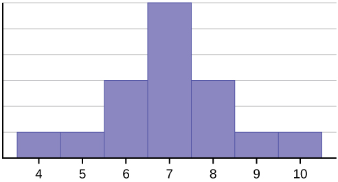
The histogram displays a symmetrical distribution of data. A distribution is symmetrical if a vertical line can be drawn at some point in the histogram such that the shape to the left and the right of the vertical line are mirror images of each other. The mean, the median, and the mode are each seven for these data. In a perfectly symmetrical distribution, the mean and the median are the same. This example has one mode (unimodal), and the mode is the same as the mean and median. In a symmetrical distribution that has two modes (bimodal), the two modes would be different from the mean and median.
⎠
The histogram for the data: 4; 5; 6; 6; 6; 7; 7; 7; 7; 8 is not symmetrical. The right-hand side seems “chopped off” compared to the left side. A distribution of this type is called skewed to the left because it is pulled out to the left. We can formally measure the skewness of a distribution just as we can mathematically measure the center weight of the data or its general
x
⎛
“speadness”. The mathematical formula for skewness is: a3 = ∑ ⎝ i
− x¯ ⎞3
ns3
. The greater the deviation from zero indicates
a greater degree of skewness. If the skewness is negative then the distribution is skewed left as in Figure 2.12. A positive measure of skewness indicates right skewness such as Figure 2.13.
The mean is 6.3, the median is 6.5, and the mode is seven. Notice that the mean is less than the median, and they are both less than the mode. The mean and the median both reflect the skewing, but the mean reflects it more so.
The histogram for the data: 6; 7; 7; 7; 7; 8; 8; 8; 9; 10, is also not symmetrical. It is skewed to the right.
This OpenStax book is available for free at http://cnx.org/content/col11776/1.33
The mean is 7.7, the median is 7.5, and the mode is seven. Of the three statistics, the mean is the largest, while the mode is the smallest. Again, the mean reflects the skewing the most.
To summarize, generally if the distribution of data is skewed to the left, the mean is less than the median, which is often less than the mode. If the distribution of data is skewed to the right, the mode is often less than the median, which is less than the mean.
As with the mean, median and mode, and as we will see shortly, the variance, there are mathematical formulas that give us precise measures of these characteristics of the distribution of the data. Again looking at the formula for skewness we see that this is a relationship between the mean of the data and the individual observations cubed.
x
⎛
a3 = ∑ ⎝ i
− x¯ ⎞3
⎠
ns3
where s is the sample standard deviation of the data, Xi , and x¯ is the arithmetic mean and n is the sample size.
Formally the arithmetic mean is known as the first moment of the distribution. The second moment we will see is the variance, and skewness is the third moment. The variance measures the squared differences of the data from the mean and skewness measures the cubed differences of the data from the mean. While a variance can never be a negative number, the measure of skewness can and this is how we determine if the data are skewed right of left. The skewness for a normal distribution is zero, and any symmetric data should have skewness near zero. Negative values for the skewness indicate data that are skewed left and positive values for the skewness indicate data that are skewed right. By skewed left, we mean that the left tail is long relative to the right tail. Similarly, skewed right means that the right tail is long relative to the left tail. The skewness characterizes the degree of asymmetry of a distribution around its mean. While the mean and standard
deviation are dimensional quantities (this is why we will take the square root of the variance ) that is, have the same units as the measured quantities Xi , the skewness is conventionally defined in such a way as to make it nondimensional. It is a
pure number that characterizes only the shape of the distribution. A positive value of skewness signifies a distribution with an asymmetric tail extending out towards more positive X and a negative value signifies a distribution whose tail extends out towards more negative X. A zero measure of skewness will indicate a symmetrical distribution.
Skewness and symmetry become important when we discuss probability distributions in later chapters.
| Measures of the Spread of the Data
An important characteristic of any set of data is the variation in the data. In some data sets, the data values are concentrated closely near the mean; in other data sets, the data values are more widely spread out from the mean. The most common measure of variation, or spread, is the standard deviation. The standard deviation is a number that measures how far data values are from their mean.
The standard deviation
- provides a numerical measure of the overall amount of variation in a data set, and
- can be used to determine whether a particular data value is close to or far from the mean.
The standard deviation provides a measure of the overall variation in a data set
The standard deviation is always positive or zero. The standard deviation is small when the data are all concentrated close to the mean, exhibiting little variation or spread. The standard deviation is larger when the data values are more spread out from the mean, exhibiting more variation.
Suppose that we are studying the amount of time customers wait in line at the checkout at supermarket A and supermarket
- The average wait time at both supermarkets is five minutes. At supermarket A, the standard deviation for the wait time is two minutes; at supermarket B. The standard deviation for the wait time is four minutes.
Because supermarket B has a higher standard deviation, we know that there is more variation in the wait times at supermarket B. Overall, wait times at supermarket B are more spread out from the average; wait times at supermarket A are more concentrated near the average.
Calculating the Standard Deviation
–
If x is a number, then the difference “x minus the mean” is called its deviation. In a data set, there are as many deviations as there are items in the data set. The deviations are used to calculate the standard deviation. If the numbers belong to a population, in symbols a deviation is x – μ. For sample data, in symbols a deviation is x – x .
The procedure to calculate the standard deviation depends on whether the numbers are the entire population or are data from a sample. The calculations are similar, but not identical. Therefore the symbol used to represent the standard deviation depends on whether it is calculated from a population or a sample. The lower case letter s represents the sample standard deviation and the Greek letter σ (sigma, lower case) represents the population standard deviation. If the sample has the same characteristics as the population, then s should be a good estimate of σ.
To calculate the standard dev–iation, we need to calculate the variance first. The variance is the average of the squares
of the deviations (the x – x values for a sample, or the x – μ values for a population). The symbol σ2 represents the
population variance; the population standard deviation σ is the square root of the population variance. The symbol s2 represents the sample variance; the sample standard deviation s is the square root of the sample variance. You can think of the standard deviation as a special average of the deviations. Formally, the variance is the second moment of the distribution or the first moment around the mean. Remember that the mean is the first moment of the distribution.
If the numbers come from a census of the entire population and not a sample, when we calculate the average of the squared deviations to find the variance, we divide by N, the number of items in the population. If the data are from a sample rather than a population, when we calculate the average of the squared deviations, we divide by n – 1, one less than the number of items in the sample.
⎛2⎞⎜ ∑ x ⎟ – n xn⎝i = 1⎠n – 1– 2
Formulas for the Sample Standard Deviation
Σ(x − –x )2 n − 1
n − 1
– 2
- s =
or s = Σ f (x − x ) or s =
- For the sample standard deviation, the denominator is n – 1, that is the sample size minus 1.
Formulas for the Population Standard Deviation
• σ=
Σ(x − µ)2 N
or σ=
Σ f (x – µ)2 N
i = 1∑ x2NiN- µ 2
or σ =
- For the population standard deviation, the denominator is N, the number of items in the population.
In these formulas, f represents the frequency with which a value appears. For example, if a value appears once, f is one. If a value appears three times in the data set or population, f is three. Two important observations concerning the variance and standard deviation: the deviations are measured from the mean and the deviations are squared. In principle, the deviations could be measured from any point, however, our interest is measurement from the center weight of the data, what is the “normal” or most usual value of the observation. Later we will be trying to measure the “unusualness” of an observation or a sample mean and thus we need a measure from the mean. The second observation is that the deviations are squared. This does two things, first it makes the deviations all positive and second it changes the units of measurement from that of the mean and the original observations. If the data are weights then the mean is measured in pounds, but the variance
This OpenStax book is available for free at http://cnx.org/content/col11776/1.33
is measured in pounds-squared. One reason to use the standard deviation is to return to the original units of measurement by taking the square root of the variance. Further, when the deviations are squared it explodes their value. For example, a deviation of 10 from the mean when squared is 100, but a deviation of 100 from the mean is 10,000. What this does is place great weight on outliers when calculating the variance.
Types of Variability in Samples
When trying to study a population, a sample is often used, either for convenience or because it is not possible to access the entire population. Variability is the term used to describe the differences that may occur in these outcomes. Common types of variability include the following:
- Observational or measurement variability
- Natural variability
- Induced variability
- Sample variability
Here are some examples to describe each type of variability.
Example 1: Measurement variability
Measurement variability occurs when there are differences in the instruments used to measure or in the people using those instruments. If we are gathering data on how long it takes for a ball to drop from a height by having students measure the time of the drop with a stopwatch, we may experience measurement variability if the two stopwatches used were made by different manufacturers: For example, one stopwatch measures to the nearest second, whereas the other one measures to the nearest tenth of a second. We also may experience measurement variability because two different people are gathering the data. Their reaction times in pressing the button on the stopwatch may differ; thus, the outcomes will vary accordingly. The differences in outcomes may be affected by measurement variability.
Example 2: Natural variability
Natural variability arises from the differences that naturally occur because members of a population differ from each other. For example, if we have two identical corn plants and we expose both plants to the same amount of water and sunlight, they may still grow at different rates simply because they are two different corn plants. The difference in outcomes may be explained by natural variability.
Example 3: Induced variability
Induced variability is the counterpart to natural variability; this occurs because we have artificially induced an element of variation (that, by definition, was not present naturally): For example, we assign people to two different groups to study memory, and we induce a variable in one group by limiting the amount of sleep they get. The difference in outcomes may be affected by induced variability.
Example 4: Sample variability
Sample variability occurs when multiple random samples are taken from the same population. For example, if I conduct four surveys of 50 people randomly selected from a given population, the differences in outcomes may be affected by sample variability.
Example 2.29In a fifth grade class, the teacher was interested in the average age and the sample standard deviation of the ages of her students. The following data are the ages for a SAMPLE of n = 20 fifth grade students. The ages are rounded to the nearest half year:9; 9.5; 9.5; 10; 10; 10; 10; 10.5; 10.5; 10.5; 10.5; 11; 11; 11; 11; 11; 11; 11.5; 11.5; 11.5;–x= 9 + 9.5(2) + 10(4) + 10.5(4) + 11(6) + 11.5(3) = 10.52520The average age is 10.53 years, rounded to two places.The variance may be calculated by using a table. Then the standard deviation is calculated by taking the square root of the variance. We will explain the parts of the table after calculating s.
|
Data |
Freq. |
Deviations |
Deviations2 |
(Freq.)(Deviations2) |
|
x |
f |
(x – –x ) |
(x – –x )2 |
(f)(x – –x )2 |
|
9 |
1 |
9 – 10.525 = –1.525 |
(–1.525)2 = 2.325625 |
1 × 2.325625 = 2.325625 |
|
9.5 |
2 |
9.5 – 10.525 = –1.025 |
(–1.025)2 = 1.050625 |
2 × 1.050625 = 2.101250 |
|
10 |
4 |
10 – 10.525 = –0.525 |
(–0.525)2 = 0.275625 |
4 × 0.275625 = 1.1025 |
|
10.5 |
4 |
10.5 – 10.525 = –0.025 |
(–0.025)2 = 0.000625 |
4 × 0.000625 = 0.0025 |
|
11 |
6 |
11 – 10.525 = 0.475 |
(0.475)2 = 0.225625 |
6 × 0.225625 = 1.35375 |
|
11.5 |
3 |
11.5 – 10.525 = 0.975 |
(0.975)2 = 0.950625 |
3 × 0.950625 = 2.851875 |
|
|
|
|
|
The total is 9.7375 |
Table 2.28
The sample variance, s2, is equal to the sum of the last column (9.7375) divided by the total number of data values minus one (20 – 1):
20 − 1
s2 = 9.7375 = 0.5125
The sample standard deviation s is equal to the square root of the sample variance:
s = 0.5125 = 0.715891, which is rounded to two decimal places, s = 0.72.
Explanation of the standard deviation calculation shown in the table
The deviations show how spread out the data are about the mean. The data value 11.5 is farther from the mean than is the data value 11 which is indicated by the deviations 0.97 and 0.47. A positive deviation occurs when the data value is greater than the mean, whereas a negative deviation occurs when the data value is less than the mean. The deviation is –1.525 for the data value nine. If you add the deviations, the sum is always zero. (For Example 2.29, there are n = 20 deviations.) So you cannot simply add the deviations to get the spread of the data. By squaring the deviations, you make them positive numbers, and the sum will also be positive. The variance, then, is the average squared deviation. By squaring the deviations we are placing an extreme penalty on observations that are far from the mean; these observations get greater weight in the calculations of the variance. We will see later on that the variance (standard deviation) plays the critical role in determining our conclusions in inferential statistics. We can begin now by using the standard deviation as a measure of “unusualness.” “How did you do on the test?” “Terrific! Two standard deviations above the mean.” This, we will see, is an unusually good exam grade.
The variance is a squared measure and does not have the same units as the data. Taking the square root solves the problem. The standard deviation measures the spread in the same units as the data.
Notice that instead of dividing by n = 20, the calculation divided by n – 1 = 20 – 1 = 19 because the data is a sample. For the sample variance, we divide by the sample size minus one (n – 1). Why not divide by n? The answer has to do with the population variance. The sample variance is an estimate of the population variance. This estimate requires us to use an estimate of the population mean rather than the actual population mean. Based on the theoretical mathematics that lies behind these calculations, dividing by (n – 1) gives a better estimate of the population variance.
The standard deviation, s or σ, is either zero or larger than zero. Describing the data with reference to the spread is called “variability”. The variability in data depends upon the method by which the outcomes are obtained; for example, by measuring or by random sampling. When the standard deviation is zero, there is no spread; that is, the all the data values are equal to each other. The standard deviation is small when the data are all concentrated close to the mean, and is larger when the data values show more variation from the mean. When the standard deviation is a lot larger than zero, the data values are very spread out about the mean; outliers can make s or σ very large.
This OpenStax book is available for free at http://cnx.org/content/col11776/1.33
Example 2.30Use the following data (first exam scores) from Susan Dean’s spring pre-calculus class:33; 42; 49; 49; 53; 55; 55; 61; 63; 67; 68; 68; 69; 69; 72; 73; 74; 78; 80; 83; 88; 88; 88; 90; 92; 94; 94; 94; 94;96; 100Create a chart containing the data, frequencies, relative frequencies, and cumulative relative frequencies to three decimal places.Calculate the following to one decimal place:The sample meanThe sample standard deviationThe medianThe first quartileThe third quartileIQRSolution 2.30See Table 2.29i. The sample mean = 73.5The sample standard deviation = 17.9The median = 73The first quartile = 61The third quartile = 90 vi. IQR = 90 – 61 = 29
|
Frequency |
Relative Frequency |
Cumulative Relative Frequency |
|
|
33 |
1 |
0.032 |
0.032 |
|
42 |
1 |
0.032 |
0.064 |
|
49 |
2 |
0.065 |
0.129 |
|
53 |
1 |
0.032 |
0.161 |
|
55 |
2 |
0.065 |
0.226 |
|
61 |
1 |
0.032 |
0.258 |
|
63 |
1 |
0.032 |
0.29 |
|
67 |
1 |
0.032 |
0.322 |
|
68 |
2 |
0.065 |
0.387 |
|
69 |
2 |
0.065 |
0.452 |
|
72 |
1 |
0.032 |
0.484 |
|
73 |
1 |
0.032 |
0.516 |
|
74 |
1 |
0.032 |
0.548 |
|
78 |
1 |
0.032 |
0.580 |
|
80 |
1 |
0.032 |
0.612 |
Table 2.29
|
Data |
Frequency |
Relative Frequency |
Cumulative Relative Frequency |
|
83 |
1 |
0.032 |
0.644 |
|
88 |
3 |
0.097 |
0.741 |
|
90 |
1 |
0.032 |
0.773 |
|
92 |
1 |
0.032 |
0.805 |
|
94 |
4 |
0.129 |
0.934 |
|
96 |
1 |
0.032 |
0.966 |
|
100 |
1 |
0.032 |
0.998 (Why isn’t this value 1? ANSWER: Rounding) |
Table 2.29
Standard deviation of Grouped Frequency Tables
Recall that for grouped data we do not know individual data values, so we cannot describe the typical value of the data with precision. In other words, we cannot find the exact mean, median, or mode. We can, however, determine the best estimate of the measures of center by finding the mean of the grouped data with the formula: Mean o f Frequency Table = ∑ f m
∑ f
where f = interval frequencies and m = interval midpoints.
Example 2.31Find the standard deviation for the data in Table 2.30.Table 2.30For this data set, we have the mean, = 7.58 and the standard deviation, sx = 3.5. This means that a randomly selected data value would be expected to be 3.5 units from the mean. If we look at the first class, we see that the class midpoint is equal to one. This is almost two full standard deviations from the mean since 7.58 – 3.5 – 3.5 =–x0.58. While the formula for calculating the standard deviation is not complicated, sx =Σ(m − –x )2 f n − 1where
Just as we could not find the exact mean, neither can we find the exact standard deviation. Remember that standard deviation describes numerically the expected deviation a data value has from the mean. In simple English, the standard deviation allows us to compare how “unusual” individual data is compared to the mean.
|
Frequency, f |
Midpoint, m |
f * m |
f (m – x– )2 |
|
|
0–2 |
1 |
1 |
1 * 1 = 1 |
1(1 – 7.58)2 = 43.26 |
|
3–5 |
6 |
4 |
6 * 4 = 24 |
6(4 – 7.58)2 = 76.77 |
|
6-8 |
10 |
7 |
10 * 7 = 70 |
10(7 – 7.58)2 = 3.33 |
|
9-11 |
7 |
10 |
7 * 10 = 70 |
7(10 – 7.58)2 = 41.10 |
|
12-14 |
0 |
13 |
0 * 13 = 0 |
0(13 – 7.58)2 = 0 |
|
|
26=n |
|
x– = 197 = 7.58 26 |
s2 = 306.35 = 12.25 26 – 1 |
This OpenStax book is available for free at http://cnx.org/content/col11776/1.33
sx = sample standard deviation, –x
= sample mean, the calculations are tedious. It is usually best to use
technology when performing the calculations.
Comparing Values from Different Data Sets
The standard deviation is useful when comparing data values that come from different data sets. If the data sets have different means and standard deviations, then comparing the data values directly can be misleading.
- For each data value x, calculate how many standard deviations away from its mean the value is.
- Use the formula: x = mean + (#ofSTDEVs)(standard deviation); solve for #ofSTDEVs.
- # o f STDEVs = st
x – mean andard deviation
- Compare the results of this calculation.
#ofSTDEVs is often called a “z-score”; we can use the symbol z. In symbols, the formulas become:
|
Sample |
x = x¯ + zs |
z = x −s –x |
|
Population |
x = µ + zσ |
z = x − µ σ |
Table 2.31
Example 2.32
Two students, John and Ali, from different high schools, wanted to find out who had the highest GPA when compared to his school. Which student had the highest GPA when compared to his school?
|
Student |
GPA |
School Mean GPA |
School Standard Deviation |
|
John |
2.85 |
3.0 |
0.7 |
|
Ali |
77 |
80 |
10 |
Table 2.32
Solution 2.32
For each student, determine how many standard deviations (#ofSTDEVs) his GPA is away from the average, for his school. Pay careful attention to signs when comparing and interpreting the answer.
z = # of STDEVs = value – mean = x – µ
standard deviationσ
0.7
For John, z = # o f STDEVs = 2.85 – 3.0 = – 0.21
10
For Ali, z = # o f STDEVs = 77 − 80 = – 0.3
John has the better GPA when compared to his school because his GPA is 0.21 standard deviations below his school’s mean while Ali’s GPA is 0.3 standard deviations below his school’s mean.
John’s z-score of –0.21 is higher than Ali’s z-score of –0.3. For GPA, higher values are better, so we conclude that John has the better GPA when compared to his school.
|
Swimmer |
Time (seconds) |
Team Mean Time |
Team Standard Deviation |
|
Angie |
26.2 |
27.2 |
0.8 |
|
Beth |
27.3 |
30.1 |
1.4 |
2.32 Two swimmers, Angie and Beth, from different teams, wanted to find out who had the fastest time for the 50 meter freestyle when compared to her team. Which swimmer had the fastest time when compared to her team?Table 2.33
The following lists give a few facts that provide a little more insight into what the standard deviation tells us about the distribution of the data.
For ANY data set, no matter what the distribution of the data is:
- At least 75% of the data is within two standard deviations of the mean.
- At least 89% of the data is within three standard deviations of the mean.
- At least 95% of the data is within 4.5 standard deviations of the mean.
- This is known as Chebyshev’s Rule.
For data having a Normal Distribution, which we will examine in great detail later:
- Approximately 68% of the data is within one standard deviation of the mean.
- Approximately 95% of the data is within two standard deviations of the mean.
- More than 99% of the data is within three standard deviations of the mean.
- This is known as the Empirical Rule.
- It is important to note that this rule only applies when the shape of the distribution of the data is bell-shaped and symmetric. We will learn more about this when studying the “Normal” or “Gaussian” probability distribution in later chapters.
Coefficient of Variation
Another useful way to compare distributions besides simple comparisons of means or standard deviations is to adjust for differences in the scale of the data being measured. Quite simply, a large variation in data with a large mean is different than the same variation in data with a small mean. To adjust for the scale of the underlying data the Coefficient of Variation (CV) has been developed. Mathematically:
¯
CV = s * 100 conditioned upon x¯ ≠ 0, where s is the standard deviation of the data and x¯ is the mean.
x
We can see that this measures the variability of the underlying data as a percentage of the mean value; the center weight of the data set. This measure is useful in comparing risk where an adjustment is warranted because of differences in scale of two data sets. In effect, the scale is changed to common scale, percentage differences, and allows direct comparison of the two or more magnitudes of variation of different data sets.
This OpenStax book is available for free at http://cnx.org/content/col11776/1.33
KEY TERMS
Frequency the number of times a value of the data occurs
Frequency Table a data representation in which grouped data is displayed along with the corresponding frequencies
Histogram a graphical representation in x–y form of the distribution of data in a data set; x represents the data and y
represents the frequency, or relative frequency. The graph consists of contiguous rectangles.
Interquartile Range or IQR, is the range of the middle 50 percent of the data values; the IQR is found by subtracting the first quartile from the third quartile.
Mean (arithmetic) a number that measures the central tendency of the data; a common name for mean is ‘average.’ The term ‘mean’ is a shortened form of ‘arithmetic mean.’ By definition, the mean for a sample (denoted by x¯ ) is
Number of values in the sample
–x = Sum of all values in the sample ,andthemeanforapopulation(denotedbyμ)is
µ =.
Sum of all values in the population Number of values in the population
Mean (geometric) a measure of central tendency that provides a measure of average geometric growth over multiple time periods.
Median a number that separates ordered data into halves; half the values are the same number or smaller than the median and half the values are the same number or larger than the median. The median may or may not be part of the data.
Midpoint the mean of an interval in a frequency table Mode the value that appears most frequently in a set of data Outlier an observation that does not fit the rest of the data
Percentile a number that divides ordered data into hundredths; percentiles may or may not be part of the data. The median of the data is the second quartile and the 50th percentile. The first and third quartiles are the 25th and the 75th percentiles, respectively.
Quartiles the numbers that separate the data into quarters; quartiles may or may not be part of the data. The second quartile is the median of the data.
Relative Frequency the ratio of the number of times a value of the data occurs in the set of all outcomes to the number of all outcomes
Standard Deviation a number that is equal to the square root of the variance and measures how far data values are from their mean; notation: s for sample standard deviation and σ for population standard deviation.
Variance mean of the squared deviations –from the mean, or the square of the sta–ndard deviation; for a set of data, a
deviation can be represented as x – x where x is a value of the data and x is the sample mean. The sample
variance is equal to the sum of the squares of the deviations divided by the difference of the sample size and one.
CHAPTER REVIEW
A stem-and-leaf plot is a way to plot data and look at the distribution. In a stem-and-leaf plot, all data values within a class are visible. The advantage in a stem-and-leaf plot is that all values are listed, unlike a histogram, which gives classes of data values. A line graph is often used to represent a set of data values in which a quantity varies with time. These graphs are useful for finding trends. That is, finding a general pattern in data sets including temperature, sales, employment, company profit or cost over a period of time. A bar graph is a chart that uses either horizontal or vertical bars to show comparisons among categories. One axis of the chart shows the specific categories being compared, and the other axis
represents a discrete value. Some bar graphs present bars clustered in groups of more than one (grouped bar graphs), and others show the bars divided into subparts to show cumulative effect (stacked bar graphs). Bar graphs are especially useful when categorical data is being used.
A histogram is a graphic version of a frequency distribution. The graph consists of bars of equal width drawn adjacent to each other. The horizontal scale represents classes of quantitative data values and the vertical scale represents frequencies. The heights of the bars correspond to frequency values. Histograms are typically used for large, continuous, quantitative data sets. A frequency polygon can also be used when graphing large data sets with data points that repeat. The data usually goes on y-axis with the frequency being graphed on the x-axis. Time series graphs can be helpful when looking at large amounts of data for one variable over a period of time.
Measures of the Location of the Data
The values that divide a rank-ordered set of data into 100 equal parts are called percentiles. Percentiles are used to compare and interpret data. For example, an observation at the 50th percentile would be greater than 50 percent of the other obeservations in the set. Quartiles divide data into quarters. The first quartile (Q1) is the 25th percentile,the second quartile (Q2 or median) is 50th percentile, and the third quartile (Q3) is the the 75th percentile. The interquartile range, or IQR, is the range of the middle 50 percent of the data values. The IQR is found by subtracting Q1 from Q3, and can help determine outliers by using the following two expressions.
• Q3 + IQR(1.5)
• Q1 – IQR(1.5)
Measures of the Center of the Data
The mean and the median can be calculated to help you find the “center” of a data set. The mean is the best estimate for the actual data set, but the median is the best measurement when a data set contains several outliers or extreme values. The mode will tell you the most frequently occuring datum (or data) in your data set. The mean, median, and mode are extremely helpful when you need to analyze your data, but if your data set consists of ranges which lack specific values, the mean may seem impossible to calculate. However, the mean can be approximated if you add the lower boundary with the upper boundary and divide by two to find the midpoint of each interval. Multiply each midpoint by the number of values found in the corresponding range. Divide the sum of these values by the total number of data values in the set.
Skewness and the Mean, Median, and Mode
Looking at the distribution of data can reveal a lot about the relationship between the mean, the median, and the mode. There are three types of distributions. A right (or positive) skewed distribution has a shape like Figure 2.12. A left (or negative) skewed distribution has a shape like Figure 2.13. A symmetrical distrubtion looks like Figure 2.11.
Measures of the Spread of the Data
The standard deviation can help you calculate the spread of data. There are different equations to use if are calculating the standard deviation of a sample or of a population.
- ∑ (x − –x )2n − 1
∑ f (x − –x )2n − 1
The Standard Deviation allows us to compare individual data or classes to the data set mean numerically.
- s =
or s =
is the formula for calculating the standard deviation of a sample.
∑ (x − µ)2 N
N
To calculate the standard deviation of a population, we would use the population mean, μ, and the formula σ = or σ =∑ f (x − µ)2 .
FORMULA REVIEW
2.2 Measures of the Location of the Data
⎝100⎠
i = ⎛ k ⎞(n + 1)
where i = the ranking or position of a data value,
k = the kth percentile,
n = total number of data.
This OpenStax book is available for free at http://cnx.org/content/col11776/1.33
⎛⎞
Expression for finding the percentile of a data value:
x + 0.5y (100)
2.6 Skewness and the Mean, Median, and Mode
⎝n⎠
⎛xi − x¯ ⎞
3
where x = the number of values counting from the bottom of the data list up to but not including the data value for
Formula for skewness: a3 = ∑ ⎝
⎠
ns3
which you want to find the percentile,
y = the number of data values equal to the data value for which you want to find the percentile,
n = total number of data
2.3 Measures of the Center of the Data
FormulaforCoefficientofVariation:
¯
CV = s * 100 conditioned upon x¯ ≠ 0
x
2.7 Measures of the Spread of the Data
µ = ∑ f m Where f = interval frequencies and m =
∑ f
sx =
∑ f m2n− x– 2
sx = sample standard deviation
where
interval midpoints.
–x = sample mean
The arithmetic mean for a sample (denoted by x¯ ) is
FormulasforSampleStandard
Deviation
n − 1
–
⎝i = 1∑ x ⎟ – n x– 2⎠n – 1
–x =
Sum of all values in the sample Number of values in the sample
s =ors = Σ f (x − x )2or
The arithmetic mean for a population (denoted by μ) is
µ =
Sum of all values in the populations =
Number of values in the population
⎛2⎞Σ(x − –x )2n − 1n⎜
For the sample standard deviation,
the denominator is n – 1, that is the sample size – 1. FormulasforPopulationStandardDeviation
Σ(x − µ)2 N
TheGeometricMean:σ=
orσ=or
Σ f (x – µ)2 N
i = ∑ x2NiN1- µ 2
⎛
⎞
n1n
~1
n x1 * x2 ∙∙∙xn
x = ⎜∏ x ⎟ =
= ⎛x * x ∙∙∙x ⎞ n
⎝i = 1 i⎠
⎝ 12n⎠σ =
For the population standard deviation,
PRACTICE
the denominator is N, the number of items in the population.
For the next three exercises, use the data to construct a line graph.
- In a survey, 40 people were asked how many times they visited a store before making a major purchase. The results are shown in Table 2.34.
Table 2.34
- In a survey, several people were asked how many years it has been since they purchased a mattress. The results are shown in Table 2.35.
Table 2.35
- Several children were asked how many TV shows they watch each day. The results of the survey are shown in Table 2.36.
Table 2.36
This OpenStax book is available for free at http://cnx.org/content/col11776/1.33
- The students in Ms. Ramirez’s math class have birthdays in each of the four seasons. Table 2.37 shows the four seasons, the number of students who have birthdays in each season, and the percentage (%) of students in each group. Construct a bar graph showing the number of students.
|
Number of students |
Proportion of population |
|
|
Spring |
8 |
24% |
|
Summer |
9 |
26% |
|
Autumn |
11 |
32% |
|
Winter |
6 |
18% |
Table 2.37
- Using the data from Mrs. Ramirez’s math class supplied in Exercise 2.4, construct a bar graph showing the percentages.
- David County has six high schools. Each school sent students to participate in a county-wide science competition. Table
2.38 shows the percentage breakdown of competitors from each school, and the percentage of the entire student population of the county that goes to each school. Construct a bar graph that shows the population percentage of competitors from each school.
|
Science competition population |
Overall student population |
|
|
Alabaster |
28.9% |
8.6% |
|
Concordia |
7.6% |
23.2% |
|
Genoa |
12.1% |
15.0% |
|
Mocksville |
18.5% |
14.3% |
|
Tynneson |
24.2% |
10.1% |
|
West End |
8.7% |
28.8% |
Table 2.38
- Use the data from the David County science competition supplied in Exercise 2.6. Construct a bar graph that shows the county-wide population percentage of students at each school.
- Sixty-five randomly selected car salespersons were asked the number of cars they generally sell in one week. Fourteen people answered that they generally sell three cars; nineteen generally sell four cars; twelve generally sell five cars; nine generally sell six cars; eleven generally sell seven cars. Complete the table.
Table 2.39
- What does the frequency column in Table 2.39 sum to? Why?
- What does the relative frequency column in Table 2.39 sum to? Why?
- What is the difference between relative frequency and frequency for each data value in Table 2.39?
- What is the difference between cumulative relative frequency and relative frequency for each data value?
- To construct the histogram for the data in Table 2.39, determine appropriate minimum and maximum x and y values and the scaling. Sketch the histogram. Label the horizontal and vertical axes with words. Include numerical scaling.
Figure 2.14
This OpenStax book is available for free at http://cnx.org/content/col11776/1.33
- Construct a frequency polygon for the following:
Pulse Rates for WomenFrequency60–691270–791480–891190–991100–1091110–1190120–1291
a.
Table 2.40
Actual Speed in a 30 MPH ZoneFrequency42–452546–491450–53754–57358–611
b.
Table 2.41
Tar (mg) in Nonfiltered CigarettesFrequency10–13114–17018–211522–25726–292
c.
Table 2.42
- Construct a frequency polygon from the frequency distribution for the 50 highest ranked countries for depth of hunger.
|
Depth of Hunger |
Frequency |
|
230–259 |
21 |
|
260–289 |
13 |
|
290–319 |
5 |
|
320–349 |
7 |
|
350–379 |
1 |
|
380–409 |
1 |
|
410–439 |
1 |
Table 2.43
- Use the two frequency tables to compare the life expectancy of men and women from 20 randomly selected countries. Include an overlayed frequency polygon and discuss the shapes of the distributions, the center, the spread, and any outliers. What can we conclude about the life expectancy of women compared to men?
|
Life Expectancy at Birth – Women |
Frequency |
|
49–55 |
3 |
|
56–62 |
3 |
|
63–69 |
1 |
|
70–76 |
3 |
|
77–83 |
8 |
|
84–90 |
2 |
Table 2.44
|
Life Expectancy at Birth – Men |
Frequency |
|
49–55 |
3 |
|
56–62 |
3 |
|
63–69 |
1 |
|
70–76 |
1 |
|
77–83 |
7 |
|
84–90 |
5 |
Table 2.45
This OpenStax book is available for free at http://cnx.org/content/col11776/1.33
- Construct a times series graph for (a) the number of male births, (b) the number of female births, and (c) the total number of births.
|
Sex/Year |
1855 |
1856 |
1857 |
1858 |
1859 |
1860 |
1861 |
|
Female |
45,545 |
49,582 |
50,257 |
50,324 |
51,915 |
51,220 |
52,403 |
|
Male |
47,804 |
52,239 |
53,158 |
53,694 |
54,628 |
54,409 |
54,606 |
|
Total |
93,349 |
101,821 |
103,415 |
104,018 |
106,543 |
105,629 |
107,009 |
Table 2.46
|
Sex/Year |
1862 |
1863 |
1864 |
1865 |
1866 |
1867 |
1868 |
1869 |
|
Female |
51,812 |
53,115 |
54,959 |
54,850 |
55,307 |
55,527 |
56,292 |
55,033 |
|
Male |
55,257 |
56,226 |
57,374 |
58,220 |
58,360 |
58,517 |
59,222 |
58,321 |
|
Total |
107,069 |
109,341 |
112,333 |
113,070 |
113,667 |
114,044 |
115,514 |
113,354 |
Table 2.47
|
Sex/Year |
1870 |
1871 |
1872 |
1873 |
1874 |
1875 |
|
Female |
56,431 |
56,099 |
57,472 |
58,233 |
60,109 |
60,146 |
|
Male |
58,959 |
60,029 |
61,293 |
61,467 |
63,602 |
63,432 |
|
Total |
115,390 |
116,128 |
118,765 |
119,700 |
123,711 |
123,578 |
Table 2.48
- The following data sets list full time police per 100,000 citizens along with homicides per 100,000 citizens for the city of Detroit, Michigan during the period from 1961 to 1973.
|
Year |
1961 |
1962 |
1963 |
1964 |
1965 |
1966 |
1967 |
|
Police |
260.35 |
269.8 |
272.04 |
272.96 |
272.51 |
261.34 |
268.89 |
|
Homicides |
8.6 |
8.9 |
8.52 |
8.89 |
13.07 |
14.57 |
21.36 |
Table 2.49
|
Year |
1968 |
1969 |
1970 |
1971 |
1972 |
1973 |
|
Police |
295.99 |
319.87 |
341.43 |
356.59 |
376.69 |
390.19 |
|
Homicides |
28.03 |
31.49 |
37.39 |
46.26 |
47.24 |
52.33 |
Table 2.50
- Construct a double time series graph using a common x-axis for both sets of data.
- Which variable increased the fastest? Explain.
- Did Detroit’s increase in police officers have an impact on the murder rate? Explain.
Measures of the Location of the Data
18; 21; 22; 25; 26; 27; 29; 30; 31; 33; 36; 37; 41; 42; 47; 52; 55; 57; 58; 62; 64; 67; 69; 71; 72; 73; 74; 76; 77
- Find the 40th percentile.
- Find the 78th percentile.
- Listed are 32 ages for Academy Award winning best actors in order from smallest to largest.
18; 18; 21; 22; 25; 26; 27; 29; 30; 31; 31; 33; 36; 37; 37; 41; 42; 47; 52; 55; 57; 58; 62; 64; 67; 69; 71; 72; 73; 74; 76; 77
- Find the percentile of 37.
- Find the percentile of 72.
- Jesse was ranked 37th in his graduating class of 180 students. At what percentile is Jesse’s ranking?
- For runners in a race, a low time means a faster run. The winners in a race have the shortest running times. Is it more desirable to have a finish time with a high or a low percentile when running a race?
- The 20th percentile of run times in a particular race is 5.2 minutes. Write a sentence interpreting the 20th percentile
in the context of the situation.
- A bicyclist in the 90th percentile of a bicycle race completed the race in 1 hour and 12 minutes. Is he among the fastest or slowest cyclists in the race? Write a sentence interpreting the 90th percentile in the context of the situation.
- For runners in a race, a higher speed means a faster run. Is it more desirable to have a speed with a high or a low percentile when running a race?
- The 40th percentile of speeds in a particular race is 7.5 miles per hour. Write a sentence interpreting the 40th
percentile in the context of the situation.
- On an exam, would it be more desirable to earn a grade with a high or low percentile? Explain.
- Mina is waiting in line at the Department of Motor Vehicles (DMV). Her wait time of 32 minutes is the 85th percentile of wait times. Is that good or bad? Write a sentence interpreting the 85th percentile in the context of this situation.
- In a survey collecting data about the salaries earned by recent college graduates, Li found that her salary was in the 78th percentile. Should Li be pleased or upset by this result? Explain.
- In a study collecting data about the repair costs of damage to automobiles in a certain type of crash tests, a certain model of car had $1,700 in damage and was in the 90th percentile. Should the manufacturer and the consumer be pleased or upset by this result? Explain and write a sentence that interprets the 90th percentile in the context of this problem.
- The University of California has two criteria used to set admission standards for freshman to be admitted to a college in the UC system:
- Students’ GPAs and scores on standardized tests (SATs and ACTs) are entered into a formula that calculates an “admissions index” score. The admissions index score is used to set eligibility standards intended to meet the goal of admitting the top 12% of high school students in the state. In this context, what percentile does the top 12% represent?
- Students whose GPAs are at or above the 96th percentile of all students at their high school are eligible (called
eligible in the local context), even if they are not in the top 12% of all students in the state. What percentage of students from each high school are “eligible in the local context”?
- Suppose that you are buying a house. You and your realtor have determined that the most expensive house you can afford is the 34th percentile. The 34th percentile of housing prices is $240,000 in the town you want to move to. In this town, can you afford 34% of the houses or 66% of the houses?
Use the following information to answer the next six exercises. Sixty-five randomly selected car salespersons were asked the number of cars they generally sell in one week. Fourteen people answered that they generally sell three cars; nineteen generally sell four cars; twelve generally sell five cars; nine generally sell six cars; eleven generally sell seven cars.
This OpenStax book is available for free at http://cnx.org/content/col11776/1.33
Measures of the Center of the Data
- Find the mean for the following frequency tables.
GradeFrequency49.5–59.5259.5–69.5369.5–79.5879.5–89.51289.5–99.55
a.
Table 2.51
Daily Low TemperatureFrequency49.5–59.55359.5–69.53269.5–79.51579.5–89.5189.5–99.50
b.
Table 2.52
Points per GameFrequency49.5–59.51459.5–69.53269.5–79.51579.5–89.52389.5–99.52
c.
Table 2.53
Use the following information to answer the next three exercises: The following data show the lengths of boats moored in a marina. The data are ordered from smallest to largest: 16; 17; 19; 20; 20; 21; 23; 24; 25; 25; 25; 26; 26; 27; 27; 27; 28; 29;
30; 32; 33; 33; 34; 35; 37; 39; 40
Use the following information to answer the next three exercises: Sixty-five randomly selected car salespersons were asked the number of cars they generally sell in one week. Fourteen people answered that they generally sell three cars; nineteen generally sell four cars; twelve generally sell five cars; nine generally sell six cars; eleven generally sell seven cars.
Calculate the following:
Sigma Notation and Calculating the Arithmetic Mean
- A group of 10 children are on a scavenger hunt to find different color rocks. The results are shown in the Table 2.54
below. The column on the right shows the number of colors of rocks each child has. What is the mean number of rocks?
Table 2.54
- A group of children are measured to determine the average height of the group. The results are in Table 2.55 below. What is the mean height of the group to the nearest hundredth of an inch?
|
Height in Inches |
|
|
Adam |
45.21 |
|
Betty |
39.45 |
|
Charlie |
43.78 |
|
Donna |
48.76 |
|
Earl |
37.39 |
|
Fran |
39.90 |
|
George |
45.56 |
|
Heather |
46.24 |
Table 2.55
This OpenStax book is available for free at http://cnx.org/content/col11776/1.33
- A person compares prices for five automobiles. The results are in Table 2.56. What is the mean price of the cars the person has considered?
Table 2.56
- A customer protection service has obtained 8 bags of candy that are supposed to contain 16 ounces of candy each. The candy is weighed to determine if the average weight is at least the claimed 16 ounces. The results are in given in Table
2.57. What is the mean weight of a bag of candy in the sample?
Table 2.57
- A teacher records grades for a class of 70, 72, 79, 81, 82, 82, 83, 90, and 95. What is the mean of these grades?
- A family is polled to see the mean of the number of hours per day the television set is on. The results, starting with Sunday, are 6, 3, 2, 3, 1, 3, and 7 hours. What is the average number of hours the family had the television set on to the nearest whole number?
- A city received the following rainfall for a recent year. What is the mean number of inches of rainfall the city received monthly, to the nearest hundredth of an inch? Use Table 2.58.
|
Rainfall in Inches |
|
|
January |
2.21 |
|
February |
3.12 |
|
March |
4.11 |
|
April |
2.09 |
|
May |
0.99 |
|
June |
1.08 |
|
July |
2.99 |
|
August |
0.08 |
|
September |
0.52 |
|
October |
1.89 |
|
November |
2.00 |
|
December |
3.06 |
Table 2.58
- A football team scored the following points in its first 8 games of the new season. Starting at game 1 and in order the scores are 14, 14, 24, 21, 7, 0, 38, and 28. What is the mean number of points the team scored in these eight games?
- What is the geometric mean of the data set given? 5, 10, 20
- What is the geometric mean of the data set given? 9.000, 15.00, 21.00
- What is the geometric mean of the data set given? 7.0, 10.0, 39.2
- What is the geometric mean of the data set given? 17.00, 10.00, 19.00
- What is the average rate of return for the values that follow? 1.0, 2.0, 1.5
- What is the average rate of return for the values that follow? 0.80, 2.0, 5.0
- What is the average rate of return for the values that follow? 0.90, 1.1, 1.2
- What is the average rate of return for the values that follow? 4.2, 4.3, 4.5
Skewness and the Mean, Median, and Mode
Use the following information to answer the next three exercises: State whether the data are symmetrical, skewed to the left, or skewed to the right.
59. 1; 1; 1; 2; 2; 2; 2; 3; 3; 3; 3; 3; 3; 3; 3; 4; 4; 4; 5; 5
60. 16; 17; 19; 22; 22; 22; 22; 22; 23
61. 87; 87; 87; 87; 87; 88; 89; 89; 90; 91
- When the data are skewed left, what is the typical relationship between the mean and median?
- When the data are symmetrical, what is the typical relationship between the mean and median?
- What word describes a distribution that has two modes?
This OpenStax book is available for free at http://cnx.org/content/col11776/1.33

Figure 2.15
- Describe the relationship between the mode and the median of this distribution.

Figure 2.16
Figure 2.17
- Describe the shape of this distribution.

Figure 2.18
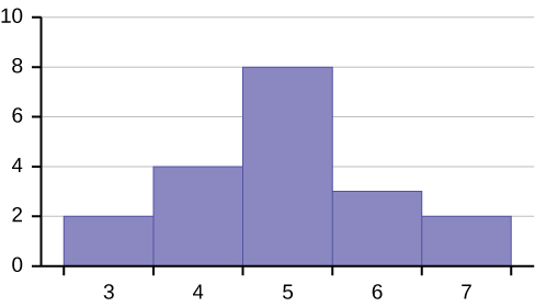
Figure 2.19
- Are the mean and the median the exact same in this distribution? Why or why not?

Figure 2.20
This OpenStax book is available for free at http://cnx.org/content/col11776/1.33

Figure 2.21
- Describe the relationship between the mode and the median of this distribution.

Figure 2.22
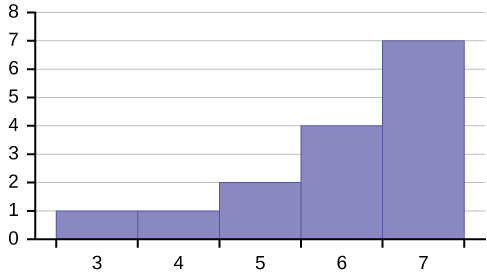
Figure 2.23
- The mean and median for the data are the same. 3; 4; 5; 5; 6; 6; 6; 6; 7; 7; 7; 7; 7; 7; 7
Is the data perfectly symmetrical? Why or why not?
- Which is the greatest, the mean, the mode, or the median of the data set? 11; 11; 12; 12; 12; 12; 13; 15; 17; 22; 22; 22
- Which is the least, the mean, the mode, and the median of the data set? 56; 56; 56; 58; 59; 60; 62; 64; 64; 65; 67
- Of the three measures, which tends to reflect skewing the most, the mean, the mode, or the median? Why?
- In a perfectly symmetrical distribution, when would the mode be different from the mean and median?
Measures of the Spread of the Data
Use the following information to answer the next two exercises: The following data are the distances between 20 retail stores and a large distribution center. The distances are in miles.
29; 37; 38; 40; 58; 67; 68; 69; 76; 86; 87; 95; 96; 96; 99; 106; 112; 127; 145; 150
- Use a graphing calculator or computer to find the standard deviation and round to the nearest tenth.
- Find the value that is one standard deviation below the mean.
- Two baseball players, Fredo and Karl, on different teams wanted to find out who had the higher batting average when compared to his team. Which baseball player had the higher batting average when compared to his team?
|
Batting Average |
Team Batting Average |
Team Standard Deviation |
|
|
Fredo |
0.158 |
0.166 |
0.012 |
|
Karl |
0.177 |
0.189 |
0.015 |
Table 2.59
- Use Table 2.59 to find the value that is three standard deviations:
- above the mean
- below the mean
Find the standard deviation for the following frequency tables using the formula. Check the calculations with the TI 83/84.
This OpenStax book is available for free at http://cnx.org/content/col11776/1.33
- Find the standard deviation for the following frequency tables using the formula. Check the calculations with the TI 83/ 84.
GradeFrequency49.5–59.5259.5–69.5369.5–79.5879.5–89.51289.5–99.55
a.
Table 2.60
Daily Low TemperatureFrequency49.5–59.55359.5–69.53269.5–79.51579.5–89.5189.5–99.50
b.
Table 2.61
Points per GameFrequency49.5–59.51459.5–69.53269.5–79.51579.5–89.52389.5–99.52
c.
Table 2.62
HOMEWORK
|
Percent (%) |
State |
Percent (%) |
State |
Percent (%) |
|
|
Alabama |
32.2 |
Kentucky |
31.3 |
North Dakota |
27.2 |
|
Alaska |
24.5 |
Louisiana |
31.0 |
Ohio |
29.2 |
|
Arizona |
24.3 |
Maine |
26.8 |
Oklahoma |
30.4 |
|
Arkansas |
30.1 |
Maryland |
27.1 |
Oregon |
26.8 |
|
California |
24.0 |
Massachusetts |
23.0 |
Pennsylvania |
28.6 |
|
Colorado |
21.0 |
Michigan |
30.9 |
Rhode Island |
25.5 |
|
Connecticut |
22.5 |
Minnesota |
24.8 |
South Carolina |
31.5 |
|
Delaware |
28.0 |
Mississippi |
34.0 |
South Dakota |
27.3 |
|
Washington, DC |
22.2 |
Missouri |
30.5 |
Tennessee |
30.8 |
|
Florida |
26.6 |
Montana |
23.0 |
Texas |
31.0 |
|
Georgia |
29.6 |
Nebraska |
26.9 |
Utah |
22.5 |
|
Hawaii |
22.7 |
Nevada |
22.4 |
Vermont |
23.2 |
|
Idaho |
26.5 |
New Hampshire |
25.0 |
Virginia |
26.0 |
|
Illinois |
28.2 |
New Jersey |
23.8 |
Washington |
25.5 |
|
Indiana |
29.6 |
New Mexico |
25.1 |
West Virginia |
32.5 |
|
Iowa |
28.4 |
New York |
23.9 |
Wisconsin |
26.3 |
|
Kansas |
29.4 |
North Carolina |
27.8 |
Wyoming |
25.1 |
Table 2.63
- Use a random number generator to randomly pick eight states. Construct a bar graph of the obesity rates of those eight states.
- Construct a bar graph for all the states beginning with the letter “A.”
- Construct a bar graph for all the states beginning with the letter “M.”
This OpenStax book is available for free at http://cnx.org/content/col11776/1.33
- Suppose that three book publishers were interested in the number of fiction paperbacks adult consumers purchase per month. Each publisher conducted a survey. In the survey, adult consumers were asked the number of fiction paperbacks they had purchased the previous month. The results are as follows:
|
# of books |
Freq. |
Rel. Freq. |
|
0 |
10 |
|
|
1 |
12 |
|
|
2 |
16 |
|
|
3 |
12 |
|
|
4 |
8 |
|
|
5 |
6 |
|
|
6 |
2 |
|
|
8 |
2 |
|
Table 2.64 Publisher A
|
# of books |
Freq. |
Rel. Freq. |
|
0 |
18 |
|
|
1 |
24 |
|
|
2 |
24 |
|
|
3 |
22 |
|
|
4 |
15 |
|
|
5 |
10 |
|
|
7 |
5 |
|
|
9 |
1 |
|
Table 2.65 Publisher B
|
# of books |
Freq. |
Rel. Freq. |
|
0–1 |
20 |
|
|
2–3 |
35 |
|
|
4–5 |
12 |
|
|
6–7 |
2 |
|
|
8–9 |
1 |
|
Table 2.66 Publisher C
- Find the relative frequencies for each survey. Write them in the charts.
- Use the frequency column to construct a histogram for each publisher’s survey. For Publishers A and B, make bar widths of one. For Publisher C, make bar widths of two.
- In complete sentences, give two reasons why the graphs for Publishers A and B are not identical.
- Would you have expected the graph for Publisher C to look like the other two graphs? Why or why not?
- Make new histograms for Publisher A and Publisher B. This time, make bar widths of two.
- Now, compare the graph for Publisher C to the new graphs for Publishers A and B. Are the graphs more similar or more different? Explain your answer.
- Often, cruise ships conduct all on-board transactions, with the exception of gambling, on a cashless basis. At the end of the cruise, guests pay one bill that covers all onboard transactions. Suppose that 60 single travelers and 70 couples were surveyed as to their on-board bills for a seven-day cruise from Los Angeles to the Mexican Riviera. Following is a summary of the bills for each group.
|
Amount($) |
Frequency |
Rel. Frequency |
|
51–100 |
5 |
|
|
101–150 |
10 |
|
|
151–200 |
15 |
|
|
201–250 |
15 |
|
|
251–300 |
10 |
|
|
301–350 |
5 |
|
Table 2.67 Singles
|
Amount($) |
Frequency |
Rel. Frequency |
|
100–150 |
5 |
|
|
201–250 |
5 |
|
|
251–300 |
5 |
|
|
301–350 |
5 |
|
|
351–400 |
10 |
|
|
401–450 |
10 |
|
|
451–500 |
10 |
|
|
501–550 |
10 |
|
|
551–600 |
5 |
|
|
601–650 |
5 |
|
Table 2.68 Couples
- Fill in the relative frequency for each group.
- Construct a histogram for the singles group. Scale the x-axis by $50 widths. Use relative frequency on the y-axis.
- Construct a histogram for the couples group. Scale the x-axis by $50 widths. Use relative frequency on the y-axis.
- Compare the two graphs:
- List two similarities between the graphs.
- List two differences between the graphs.
- Overall, are the graphs more similar or different?
- Construct a new graph for the couples by hand. Since each couple is paying for two individuals, instead of scaling the x-axis by $50, scale it by $100. Use relative frequency on the y-axis.
- Compare the graph for the singles with the new graph for the couples:
- List two similarities between the graphs.
- Overall, are the graphs more similar or different?
- How did scaling the couples graph differently change the way you compared it to the singles graph?
- Based on the graphs, do you think that individuals spend the same amount, more or less, as singles as they do person by person as a couple? Explain why in one or two complete sentences.
This OpenStax book is available for free at http://cnx.org/content/col11776/1.33
- Twenty-five randomly selected students were asked the number of movies they watched the previous week. The results are as follows.
|
# of movies |
Frequency |
Relative Frequency |
Cumulative Relative Frequency |
|
0 |
5 |
|
|
|
1 |
9 |
|
|
|
2 |
6 |
|
|
|
3 |
4 |
|
|
|
4 |
1 |
|
|
Table 2.69
- Construct a histogram of the data.
- Complete the columns of the chart.
Use the following information to answer the next two exercises: Suppose one hundred eleven people who shopped in a special t-shirt store were asked the number of t-shirts they own costing more than $19 each.
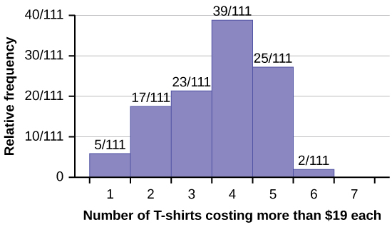
- The percentage of people who own at most three t-shirts costing more than $19 each is approximately:
- 21
- 59
- 41
- Cannot be determined
- If the data were collected by asking the first 111 people who entered the store, then the type of sampling is:
- cluster
- simple random
- stratified
- convenience
|
State |
Percent (%) |
State |
Percent (%) |
State |
Percent (%) |
|
Alabama |
32.2 |
Kentucky |
31.3 |
North Dakota |
27.2 |
|
Alaska |
24.5 |
Louisiana |
31.0 |
Ohio |
29.2 |
|
Arizona |
24.3 |
Maine |
26.8 |
Oklahoma |
30.4 |
|
Arkansas |
30.1 |
Maryland |
27.1 |
Oregon |
26.8 |
|
California |
24.0 |
Massachusetts |
23.0 |
Pennsylvania |
28.6 |
|
Colorado |
21.0 |
Michigan |
30.9 |
Rhode Island |
25.5 |
|
Connecticut |
22.5 |
Minnesota |
24.8 |
South Carolina |
31.5 |
|
Delaware |
28.0 |
Mississippi |
34.0 |
South Dakota |
27.3 |
|
Washington, DC |
22.2 |
Missouri |
30.5 |
Tennessee |
30.8 |
|
Florida |
26.6 |
Montana |
23.0 |
Texas |
31.0 |
|
Georgia |
29.6 |
Nebraska |
26.9 |
Utah |
22.5 |
|
Hawaii |
22.7 |
Nevada |
22.4 |
Vermont |
23.2 |
|
Idaho |
26.5 |
New Hampshire |
25.0 |
Virginia |
26.0 |
|
Illinois |
28.2 |
New Jersey |
23.8 |
Washington |
25.5 |
|
Indiana |
29.6 |
New Mexico |
25.1 |
West Virginia |
32.5 |
|
Iowa |
28.4 |
New York |
23.9 |
Wisconsin |
26.3 |
|
Kansas |
29.4 |
North Carolina |
27.8 |
Wyoming |
25.1 |
Table 2.70
Construct a bar graph of obesity rates of your state and the four states closest to your state. Hint: Label the x-axis with the states.
Measures of the Location of the Data
- The median age for U.S. blacks currently is 30.9 years; for U.S. whites it is 42.3 years.
- Based upon this information, give two reasons why the black median age could be lower than the white median age.
- Does the lower median age for blacks necessarily mean that blacks die younger than whites? Why or why not?
- How might it be possible for blacks and whites to die at approximately the same age, but for the median age for whites to be higher?
This OpenStax book is available for free at http://cnx.org/content/col11776/1.33
- Six hundred adult Americans were asked by telephone poll, “What do you think constitutes a middle-class income?” The results are in Table 2.71. Also, include left endpoint, but not the right endpoint.
|
Relative Frequency |
|
|
< 20,000 |
0.02 |
|
20,000–25,000 |
0.09 |
|
25,000–30,000 |
0.19 |
|
30,000–40,000 |
0.26 |
|
40,000–50,000 |
0.18 |
|
50,000–75,000 |
0.17 |
|
75,000–99,999 |
0.02 |
|
100,000+ |
0.01 |
Table 2.71
- What percentage of the survey answered “not sure”?
- What percentage think that middle-class is from $25,000 to $50,000?
- Construct a histogram of the data.
- Should all bars have the same width, based on the data? Why or why not?
- How should the <20,000 and the 100,000+ intervals be handled? Why?
- Find the 40th and 80th percentiles
- Construct a bar graph of the data
Measures of the Center of the Data
- The most obese countries in the world have obesity rates that range from 11.4% to 74.6%. This data is summarized in the following table.
|
Percent of Population Obese |
Number of Countries |
|
11.4–20.45 |
29 |
|
20.45–29.45 |
13 |
|
29.45–38.45 |
4 |
|
38.45–47.45 |
0 |
|
47.45–56.45 |
2 |
|
56.45–65.45 |
1 |
|
65.45–74.45 |
0 |
|
74.45–83.45 |
1 |
Table 2.72
- What is the best estimate of the average obesity percentage for these countries?
- The United States has an average obesity rate of 33.9%. Is this rate above average or below?
- How does the United States compare to other countries?
- Table 2.73 gives the percent of children under five considered to be underweight. What is the best estimate for the mean percentage of underweight children?
|
Number of Countries |
|
|
16–21.45 |
23 |
|
21.45–26.9 |
4 |
|
26.9–32.35 |
9 |
|
32.35–37.8 |
7 |
|
37.8–43.25 |
6 |
|
43.25–48.7 |
1 |
Table 2.73
- Sigma Notation and Calculating the Arithmetic Mean
- A sample of 10 prices is chosen from a population of 100 similar items. The values obtained from the sample, and the values for the population, are given in Table 2.74 and Table 2.75 respectively.
- Is the mean of the sample within $1 of the population mean?
- What is the difference in the sample and population means?
Table 2.74
Table 2.75
This OpenStax book is available for free at http://cnx.org/content/col11776/1.33
- A standardized test is given to ten people at the beginning of the school year with the results given in Table 2.76 below. At the end of the year the same people were again tested.
- What is the average improvement?
- Does it matter if the means are subtracted, or if the individual values are subtracted?
|
Beginning Score |
Ending Score |
|
|
1 |
1100 |
1120 |
|
2 |
980 |
1030 |
|
3 |
1200 |
1208 |
|
4 |
998 |
1000 |
|
5 |
893 |
948 |
|
6 |
1015 |
1030 |
|
7 |
1217 |
1224 |
|
8 |
1232 |
1245 |
|
9 |
967 |
988 |
|
10 |
988 |
997 |
Table 2.76
- A small class of 7 students has a mean grade of 82 on a test. If six of the grades are 80, 82,86, 90, 90, and 95, what is the other grade?
- A class of 20 students has a mean grade of 80 on a test. Nineteen of the students has a mean grade between 79 and 82, inclusive.
- What is the lowest possible grade of the other student?
- What is the highest possible grade of the other student?
- If the mean of 20 prices is $10.39, and 5 of the items with a mean of $10.99 are sampled, what is the mean of the other 15 prices?
- An investment grows from $10,000 to $22,000 in five years. What is the average rate of return?
- An initial investment of $20,000 grows at a rate of 9% for five years. What is its final value?
- A culture contains 1,300 bacteria. The bacteria grow to 2,000 in 10 hours. What is the rate at which the bacteria grow per hour to the nearest tenth of a percent?
- An investment of $3,000 grows at a rate of 5% for one year, then at a rate of 8% for three years. What is the average rate of return to the nearest hundredth of a percent?
- An investment of $10,000 goes down to $9,500 in four years. What is the average return per year to the nearest hundredth of a percent?
Skewness and the Mean, Median, and Mode
- The median age of the U.S. population in 1980 was 30.0 years. In 1991, the median age was 33.1 years.
- What does it mean for the median age to rise?
- Give two reasons why the median age could rise.
- For the median age to rise, is the actual number of children less in 1991 than it was in 1980? Why or why not?
Measures of the Spread of the Data
Use the following information to answer the next nine exercises: The population parameters below describe the full-time equivalent number of students (FTES) each year at Lake Tahoe Community College from 1976–1977 through 2004–2005.
• μ = 1000 FTES
- median = 1,014 FTES
• σ = 474 FTES
- first quartile = 528.5 FTES
- third quartile = 1,447.5 FTES
- n = 29 years
- A sample of 11 years is taken. About how many are expected to have a FTES of 1014 or above? Explain how you determined your answer.
- 75% of all years have an FTES:
- at or below:
- at or above:
- The population standard deviation =
- What percent of the FTES were from 528.5 to 1447.5? How do you know?
- What is the IQR? What does the IQR represent?
- How many standard deviations away from the mean is the median?
Additional Information: The population FTES for 2005–2006 through 2010–2011 was given in an updated report. The data are reported here.
|
Year |
2005–06 |
2006–07 |
2007–08 |
2008–09 |
2009–10 |
2010–11 |
|
Total FTES |
1,585 |
1,690 |
1,735 |
1,935 |
2,021 |
1,890 |
Table 2.77
- Calculate the mean, median, standard deviation, the first quartile, the third quartile and the IQR. Round to one decimal place.
- Compare the IQR for the FTES for 1976–77 through 2004–2005 with the IQR for the FTES for 2005-2006 through 2010–2011. Why do you suppose the IQRs are so different?
- Three students were applying to the same graduate school. They came from schools with different grading systems. Which student had the best GPA when compared to other students at his school? Explain how you determined your answer.
|
Student |
GPA |
School Average GPA |
School Standard Deviation |
|
Thuy |
2.7 |
3.2 |
0.8 |
|
Vichet |
87 |
75 |
20 |
|
Kamala |
8.6 |
8 |
0.4 |
Table 2.78
- A music school has budgeted to purchase three musical instruments. They plan to purchase a piano costing $3,000, a guitar costing $550, and a drum set costing $600. The mean cost for a piano is $4,000 with a standard deviation of $2,500. The mean cost for a guitar is $500 with a standard deviation of $200. The mean cost for drums is $700 with a standard deviation of $100. Which cost is the lowest, when compared to other instruments of the same type? Which cost is the highest when compared to other instruments of the same type. Justify your answer.
This OpenStax book is available for free at http://cnx.org/content/col11776/1.33
- An elementary school class ran one mile with a mean of 11 minutes and a standard deviation of three minutes. Rachel, a student in the class, ran one mile in eight minutes. A junior high school class ran one mile with a mean of nine minutes and a standard deviation of two minutes. Kenji, a student in the class, ran 1 mile in 8.5 minutes. A high school class ran one mile with a mean of seven minutes and a standard deviation of four minutes. Nedda, a student in the class, ran one mile in eight minutes.
- Why is Kenji considered a better runner than Nedda, even though Nedda ran faster than he?
- Who is the fastest runner with respect to his or her class? Explain why.
- The most obese countries in the world have obesity rates that range from 11.4% to 74.6%. This data is summarized in
|
Number of Countries |
|
|
11.4–20.45 |
29 |
|
20.45–29.45 |
13 |
|
29.45–38.45 |
4 |
|
38.45–47.45 |
0 |
|
47.45–56.45 |
2 |
|
56.45–65.45 |
1 |
|
65.45–74.45 |
0 |
|
74.45–83.45 |
1 |
Table 2.79
What is the best estimate of the average obesity percentage for these countries? What is the standard deviation for the listed obesity rates? The United States has an average obesity rate of 33.9%. Is this rate above average or below? How “unusual” is the United States’ obesity rate compared to the average rate? Explain.
- Table 2.80 gives the percent of children under five considered to be underweight.
|
Number of Countries |
|
|
16–21.45 |
23 |
|
21.45–26.9 |
4 |
|
26.9–32.35 |
9 |
|
32.35–37.8 |
7 |
|
37.8–43.25 |
6 |
|
43.25–48.7 |
1 |
Table 2.80
What is the best estimate for the mean percentage of underweight children? What is the standard deviation? Which interval(s) could be considered unusual? Explain.
BRINGING IT TOGETHER: HOMEWORK
- Javier and Ercilia are supervisors at a shopping mall. Each was given the task of estimating the mean distance that shoppers live from the mall. They each randomly surveyed 100 shoppers. The samples yielded the following information.
|
|
Javier |
Ercilia |
|
x¯ |
6.0 miles |
6.0 miles |
|
s |
4.0 miles |
7.0 miles |
Table 2.81
- How can you determine which survey was correct ?
- Explain what the difference in the results of the surveys implies about the data.
- If the two histograms depict the distribution of values for each supervisor, which one depicts Ercilia’s sample? How do you know?
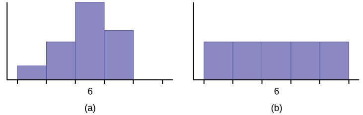
Figure 2.24
Use the following information to answer the next three exercises: We are interested in the number of years students in a particular elementary statistics class have lived in California. The information in the following table is from the entire section.
|
Number of years |
Frequency |
Number of years |
Frequency |
|
7 |
1 |
22 |
1 |
|
14 |
3 |
23 |
1 |
|
15 |
1 |
26 |
1 |
|
18 |
1 |
40 |
2 |
|
19 |
4 |
42 |
2 |
|
20 |
3 |
|
|
|
|
|
|
Total = 20 |
Table 2.82
This OpenStax book is available for free at http://cnx.org/content/col11776/1.33
- What is the mode?
- 19
b. 19.5
- 14 and 20 d. 22.65
- Is this a sample or the entire population?
- sample
- entire population
- neither
- Twenty-five randomly selected students were asked the number of movies they watched the previous week. The results are as follows:
|
# of movies |
Frequency |
|
0 |
5 |
|
1 |
9 |
|
2 |
6 |
|
3 |
4 |
|
4 |
1 |
- Find the sample mean x¯ .
Table 2.83
- Find the approximate sample standard deviation, s.
- Forty randomly selected students were asked the number of pairs of sneakers they owned. Let X = the number of pairs of sneakers owned. The results are as follows:
|
X |
Frequency |
|
1 |
2 |
|
2 |
5 |
|
3 |
8 |
|
4 |
12 |
|
5 |
12 |
|
6 |
0 |
|
7 |
1 |
Table 2.84
- Find the sample mean x¯
- Find the sample standard deviation, s
- Construct a histogram of the data.
- Complete the columns of the chart.
- Find the first quartile.
- Find the median.
- Find the third quartile.
- What percent of the students owned at least five pairs?
- Find the 40th percentile.
- Find the 90th percentile.
- Construct a line graph of the data
- Construct a stemplot of the data
- Following are the published weights (in pounds) of all of the team members of the San Francisco 49ers from a previous year.
177; 205; 210; 210; 232; 205; 185; 185; 178; 210; 206; 212; 184; 174; 185; 242; 188; 212; 215; 247; 241; 223; 220; 260;
245; 259; 278; 270; 280; 295; 275; 285; 290; 272; 273; 280; 285; 286; 200; 215; 185; 230; 250; 241; 190; 260; 250; 302;
265; 290; 276; 228; 265
- Organize the data from smallest to largest value.
- Find the median.
- Find the first quartile.
- Find the third quartile.
- The middle 50% of the weights are from to .
- If our population were all professional football players, would the above data be a sample of weights or the population of weights? Why?
- If our population included every team member who ever played for the San Francisco 49ers, would the above data be a sample of weights or the population of weights? Why?
- Assume the population was the San Francisco 49ers. Find:
- the population mean, μ.
- the population standard deviation, σ.
- the weight that is two standard deviations below the mean.
- When Steve Young, quarterback, played football, he weighed 205 pounds. How many standard deviations above or below the mean was he?
- That same year, the mean weight for the Dallas Cowboys was 240.08 pounds with a standard deviation of 44.38 pounds. Emmit Smith weighed in at 209 pounds. With respect to his team, who was lighter, Smith or Young? How did you determine your answer?
- One hundred teachers attended a seminar on mathematical problem solving. The attitudes of a representative sample of 12 of the teachers were measured before and after the seminar. A positive number for change in attitude indicates that a teacher’s attitude toward math became more positive. The 12 change scores are as follows:
3; 8; –1; 2; 0; 5; –3; 1; –1; 6; 5; –2
- What is the mean change score?
- What is the standard deviation for this population?
- What is the median change score?
- Find the change score that is 2.2 standard deviations below the mean.
- Refer to Figure 2.25 determine which of the following are true and which are false. Explain your solution to each part in complete sentences.
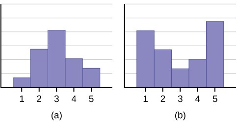
- The medians for both graphs are the same.
- We cannot determine if any of the means for both graphs is different.
- The standard deviation for graph b is larger than the standard deviation for graph a.
- We cannot determine if any of the third quartiles for both graphs is different.
This OpenStax book is available for free at http://cnx.org/content/col11776/1.33
- In a recent issue of the IEEE Spectrum, 84 engineering conferences were announced. Four conferences lasted two days. Thirty-six lasted three days. Eighteen lasted four days. Nineteen lasted five days. Four lasted six days. One lasted seven days. One lasted eight days. One lasted nine days. Let X = the length (in days) of an engineering conference.
- Organize the data in a chart.
- Find the median, the first quartile, and the third quartile.
- Find the 65th percentile.
- Find the 10th percentile.
- The middle 50% of the conferences last from days to days.
- Calculate the sample mean of days of engineering conferences.
- Calculate the sample standard deviation of days of engineering conferences.
- Find the mode.
- If you were planning an engineering conference, which would you choose as the length of the conference: mean; median; or mode? Explain why you made that choice.
- Give two reasons why you think that three to five days seem to be popular lengths of engineering conferences.
- A survey of enrollment at 35 community colleges across the United States yielded the following figures:
6414; 1550; 2109; 9350; 21828; 4300; 5944; 5722; 2825; 2044; 5481; 5200; 5853; 2750; 10012; 6357; 27000; 9414; 7681;
3200; 17500; 9200; 7380; 18314; 6557; 13713; 17768; 7493; 2771; 2861; 1263; 7285; 28165; 5080; 11622
- Organize the data into a chart with five intervals of equal width. Label the two columns “Enrollment” and “Frequency.”
- Construct a histogram of the data.
- If you were to build a new community college, which piece of information would be more valuable: the mode or the mean?
- Calculate the sample mean.
- Calculate the sample standard deviation.
- A school with an enrollment of 8000 would be how many standard deviations away from the mean?
Use the following information to answer the next two exercises. X = the number of days per week that 100 clients use a particular exercise facility.
|
x |
Frequency |
|
0 |
3 |
|
1 |
12 |
|
2 |
33 |
|
3 |
28 |
|
4 |
11 |
|
5 |
9 |
|
6 |
4 |
Table 2.85
- The 80th percentile is
- 5
- 80
- 3
- 4
- The number that is 1.5 standard deviations BELOW the mean is approximately
a. 0.7
b. 4.8
c. –2.8
- Cannot be determined
- Suppose that a publisher conducted a survey asking adult consumers the number of fiction paperback books they had purchased in the previous month. The results are summarized in the Table 2.86.
Table 2.86
- Are there any outliers in the data? Use an appropriate numerical test involving the IQR to identify outliers, if any, and clearly state your conclusion.
- If a data value is identified as an outlier, what should be done about it?
- Are any data values further than two standard deviations away from the mean? In some situations, statisticians may use this criteria to identify data values that are unusual, compared to the other data values. (Note that this criteria is most appropriate to use for data that is mound-shaped and symmetric, rather than for skewed data.)
- Do parts a and c of this problem give the same answer?
- Examine the shape of the data. Which part, a or c, of this question gives a more appropriate result for this data?
- Based on the shape of the data which is the most appropriate measure of center for this data: mean, median or mode?
REFERENCES
Burbary, Ken. Facebook Demographics Revisited – 2001 Statistics, 2011. Available online at http://www.kenburbary.com/ 2011/03/facebook-demographics-revisited-2011-statistics-2/ (accessed August 21, 2013).
“9th Annual AP Report to the Nation.” CollegeBoard, 2013. Available online at http://apreport.collegeboard.org/goals-and- findings/promoting-equity (accessed September 13, 2013).
“Overweight and Obesity: Adult Obesity Facts.” Centers for Disease Control and Prevention. Available online at http://www.cdc.gov/obesity/data/adult.html (accessed September 13, 2013).
Data on annual homicides in Detroit, 1961–73, from Gunst & Mason’s book ‘Regression Analysis and its Application’,
Marcel Dekker
“Timeline: Guide to the U.S. Presidents: Information on every president’s birthplace, political party, term of office, and more.” Scholastic, 2013. Available online at http://www.scholastic.com/teachers/article/timeline-guide-us-presidents (accessed April 3, 2013).
“Presidents.” Fact Monster. Pearson Education, 2007. Available online at http://www.factmonster.com/ipka/A0194030.html (accessed April 3, 2013).
“Food Security Statistics.” Food and Agriculture Organization of the United Nations. Available online at http://www.fao.org/economic/ess/ess-fs/en/ (accessed April 3, 2013).
“Consumer Price Index.” United States Department of Labor: Bureau of Labor Statistics. Available online at http://data.bls.gov/pdq/SurveyOutputServlet (accessed April 3, 2013).
“CO2 emissions (kt).” The World Bank, 2013. Available online at http://databank.worldbank.org/data/home.aspx (accessed
This OpenStax book is available for free at http://cnx.org/content/col11776/1.33
April 3, 2013).
“Births Time Series Data.” General Register Office For Scotland, 2013. Available online at http://www.gro-scotland.gov.uk/ statistics/theme/vital-events/births/time-series.html (accessed April 3, 2013).
“Demographics:Childrenundertheageof5yearsunderweight.”Indexmundi.Availableonlineat http://www.indexmundi.com/g/r.aspx?t=50&v=2224&aml=en (accessed April 3, 2013).
Gunst, Richard, Robert Mason. Regression Analysis and Its Application: A Data-Oriented Approach. CRC Press: 1980.
“Overweight and Obesity: Adult Obesity Facts.” Centers for Disease Control and Prevention. Available online at http://www.cdc.gov/obesity/data/adult.html (accessed September 13, 2013).
Measures of the Location of the Data
Cauchon, Dennis, Paul Overberg. “Census data shows minorities now a majority of U.S. births.” USA Today, 2012. Available online at http://usatoday30.usatoday.com/news/nation/story/2012-05-17/minority-birthscensus/55029100/1 (accessed April 3, 2013).
Data from the United States Department of Commerce: United States Census Bureau. Available online at http://www.census.gov/ (accessed April 3, 2013).
“1990 Census.” United States Department of Commerce: United States Census Bureau. Available online at http://www.census.gov/main/www/cen1990.html (accessed April 3, 2013).
Data from San Jose Mercury News.
Data from Time Magazine; survey by Yankelovich Partners, Inc.
Measures of the Center of the Data
Data from The World Bank, available online at http://www.worldbank.org (accessed April 3, 2013).
“Demographics: Obesity – adult prevalence rate.” Indexmundi. Available online at http://www.indexmundi.com/g/ r.aspx?t=50&v=2228&l=en (accessed April 3, 2013).
Measures of the Spread of the Data
Data from Microsoft Bookshelf.
King, Bill.“Graphically Speaking.” Institutional Research, Lake Tahoe Community College. Available online at http://www.ltcc.edu/web/about/institutional-research (accessed April 3, 2013).
SOLUTIONS
Figure 2.26
Figure 2.27
This OpenStax book is available for free at http://cnx.org/content/col11776/1.33
Figure 2.28
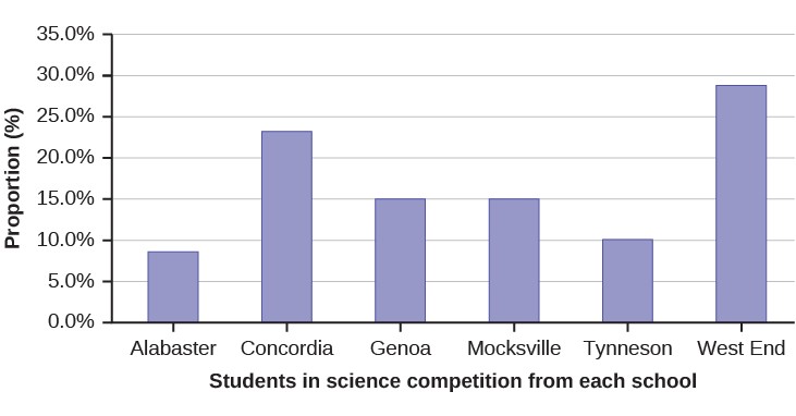
Figure 2.29
9 65
11 The relative frequency shows the proportion of data points that have each value. The frequency tells the number of data points that have each value.
13 Answers will vary. One possible histogram is shown:
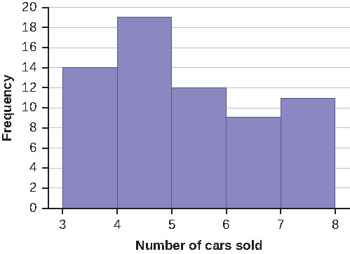
Figure 2.30
15 Find the midpoint for each class. These will be graphed on the x-axis. The frequency values will be graphed on the
- xis values.
Figure 2.31
This OpenStax book is available for free at http://cnx.org/content/col11776/1.33
Figure 2.32
- The 40th percentile is 37 years.
- The 78th percentile is 70 years.
21 Jesse graduated 37th out of a class of 180 students. There are 180 – 37 = 143 students ranked below Jesse. There is one rank of 37. x = 143 and y = 1. x + 0.5y (100) = 143 + 0.5(1) (100) = 79.72. Jesse’s rank of 37 puts him at the 80th
n180
percentile.
- For runners in a race it is more desirable to have a high percentile for speed. A high percentile means a higher speed which is faster.
- 40% of runners ran at speeds of 7.5 miles per hour or less (slower). 60% of runners ran at speeds of 7.5 miles per hour or more (faster).
25 When waiting in line at the DMV, the 85th percentile would be a long wait time compared to the other people waiting. 85% of people had shorter wait times than Mina. In this context, Mina would prefer a wait time corresponding to a lower percentile. 85% of people at the DMV waited 32 minutes or less. 15% of people at the DMV waited 32 minutes or longer.
27 The manufacturer and the consumer would be upset. This is a large repair cost for the damages, compared to the other cars in the sample. INTERPRETATION: 90% of the crash tested cars had damage repair costs of $1700 or less; only 10% had damage repair costs of $1700 or more.
29 You can afford 34% of houses. 66% of the houses are too expensive for your budget. INTERPRETATION: 34% of houses cost $240,000 or less. 66% of houses cost $240,000 or more.
31 4
33 6 – 4 = 2
35 6
37 Mean: 16 + 17 + 19 + 20 + 20 + 21 + 23 + 24 + 25 + 25 + 25 + 26 + 26 + 27 + 27 + 27 + 28 + 29 + 30 + 32 + 33 + 33
+ 34 + 35 + 37 + 39 + 40 = 738; 738
27
= 27.33
39 The most frequent lengths are 25 and 27, which occur three times. Mode = 25, 27
41 4
44 39.48 in.
45 $21,574
46 15.98 ounces
47 81.56
- 4 hours
- 2.01 inches
50 18.25
51 10
52 14.15
53 14
54 14.78
55 44%
56 100%
57 6%
58 33%
59 The data are symmetrical. The median is 3 and the mean is 2.85. They are close, and the mode lies close to the middle of the data, so the data are symmetrical.
61 The data are skewed right. The median is 87.5 and the mean is 88.2. Even though they are close, the mode lies to the left of the middle of the data, and there are many more instances of 87 than any other number, so the data are skewed right.
63 When the data are symmetrical, the mean and median are close or the same.
65 The distribution is skewed right because it looks pulled out to the right.
67 The mean is 4.1 and is slightly greater than the median, which is four.
69 The mode and the median are the same. In this case, they are both five.
71 The distribution is skewed left because it looks pulled out to the left.
73 The mean and the median are both six.
75 The mode is 12, the median is 12.5, and the mean is 15.1. The mean is the largest.
77 The mean tends to reflect skewing the most because it is affected the most by outliers.
79 s = 34.5
81 For Fredo: z = 0.158 – 0.166
0.012
= –0.67 For Karl: z = 0.177 – 0.189
0.015
= –0.8 Fredo’s z-score of –0.67 is higher than
Karl’s z-score of –0.8. For batting average, higher values are better, so Fredo has a better batting average compared to his team.
- s
= ∑ f m2 − –x 2 = 193157.45 − 79.52 = 10.88
xn30
s
= ∑ f m2 − –x 2 = 380945.3 − 60.942 = 7.62
xn101
s
= ∑ f m2 − –x 2 = 440051.5 − 70.662 = 11.14
xn86
This OpenStax book is available for free at http://cnx.org/content/col11776/1.33
a. Example solution for using the random number generator for the TI-84+ to generate a simple random sample of 8 states. Instructions are as follows.
Number the entries in the table 1–51 (Includes Washington, DC; Numbered vertically) Press MATH
Arrow over to PRB Press 5:randInt( Enter 51,1,8)
Eight numbers are generated (use the right arrow key to scroll through the numbers). The numbers correspond to the numbered states (for this example: {47 21 9 23 51 13 25 4}. If any numbers are repeated, generate a different number by using 5:randInt(51,1)). Here, the states (and Washington DC) are {Arkansas, Washington DC, Idaho, Maryland, Michigan, Mississippi, Virginia, Wyoming}.
Corresponding percents are {30.1, 22.2, 26.5, 27.1, 30.9, 34.0, 26.0, 25.1}.
Figure 2.33
b.
Figure 2.34
 c.
c.
Figure 2.35
|
Frequency |
Relative Frequency |
|
|
51–100 |
5 |
0.08 |
|
101–150 |
10 |
0.17 |
|
151–200 |
15 |
0.25 |
|
201–250 |
15 |
0.25 |
|
251–300 |
10 |
0.17 |
|
301–350 |
5 |
0.08 |
Table 2.87 Singles
|
Frequency |
Relative Frequency |
|
|
100–150 |
5 |
0.07 |
|
201–250 |
5 |
0.07 |
|
251–300 |
5 |
0.07 |
|
301–350 |
5 |
0.07 |
|
351–400 |
10 |
0.14 |
|
401–450 |
10 |
0.14 |
|
451–500 |
10 |
0.14 |
|
501–550 |
10 |
0.14 |
|
551–600 |
5 |
0.07 |
|
601–650 |
5 |
0.07 |
Table 2.88 Couples
This OpenStax book is available for free at http://cnx.org/content/col11776/1.33
- See Table 2.68 and Table 2.68.
- In the following histogram data values that fall on the right boundary are counted in the class interval, while values that fall on the left boundary are not counted (with the exception of the first interval where both boundary values are included).
Figure 2.36
- In the following histogram, the data values that fall on the right boundary are counted in the class interval, while values that fall on the left boundary are not counted (with the exception of the first interval where values on both boundaries are included).
Figure 2.37
- Compare the two graphs:
- Answers may vary. Possible answers include:
- Both graphs have a single peak.
- Both graphs use class intervals with width equal to $50.
- Answers may vary. Possible answers include:
- The couples graph has a class interval with no values.
- It takes almost twice as many class intervals to display the data for couples.
- Answers may vary. Possible answers include: The graphs are more similar than different because the overall
patterns for the graphs are the same.
- Check student’s solution.
- Compare the graph for the Singles with the new graph for the Couples:
- ▪ Both graphs have a single peak.
- Both graphs display 6 class intervals.
- Both graphs show the same general pattern.
- Answers may vary. Possible answers include: Although the width of the class intervals for couples is double that of the class intervals for singles, the graphs are more similar than they are different.
- Answers may vary. Possible answers include: You are able to compare the graphs interval by interval. It is easier to compare the overall patterns with the new scale on the Couples graph. Because a couple represents two individuals, the new scale leads to a more accurate comparison.
- Answers may vary. Possible answers include: Based on the histograms, it seems that spending does not vary much from singles to individuals who are part of a couple. The overall patterns are the same. The range of spending for couples is approximately double the range for individuals.
88 c
90 Answers will vary.
a. 1 – (0.02+0.09+0.19+0.26+0.18+0.17+0.02+0.01) = 0.06
b. 0.19+0.26+0.18 = 0.63
- Check student’s solution.
- 40th percentile will fall between 30,000 and 40,000 80th percentile will fall between 50,000 and 75,000
- Check student’s solution.
50
94 The mean percentage, –x = 1328.65 = 26.75
- Yes
- The sample is 0.5 higher.
- 20
- No
97 51
- 42
- 99
99 $10.19
100 17%
101 $30,772.48
102 4.4%
103 7.24%
104 -1.27%
106 The median value is the middle value in the ordered list of data values. The median value of a set of 11 will be the 6th
This OpenStax book is available for free at http://cnx.org/content/col11776/1.33
number in order. Six years will have totals at or below the median.
108 474 FTES
110 919
• mean = 1,809.3
• median = 1,812.5
- standard deviation = 151.2
- first quartile = 1,690
- third quartile = 1,935
• IQR = 245
113 Hint: Think about the number of years covered by each time period and what happened to higher education during those periods.
115 For pianos, the cost of the piano is 0.4 standard deviations BELOW the mean. For guitars, the cost of the guitar is 0.25 standard deviations ABOVE the mean. For drums, the cost of the drum set is 1.0 standard deviations BELOW the mean. Of the three, the drums cost the lowest in comparison to the cost of other instruments of the same type. The guitar costs the most in comparison to the cost of other instruments of the same type.
117 –
•x = 23.32
- Using the TI 83/84, we obtain a standard deviation of: sx = 12.95.
- The obesity rate of the United States is 10.58% higher than the average obesity rate.
- Since the standard deviation is 12.95, we see that 23.32 + 12.95 = 36.27 is the obesity percentage that is one standard deviation from the mean. The United States obesity rate is slightly less than one standard deviation from the mean. Therefore, we can assume that the United States, while 34% obese, does not hav e an unusually high percentage of obese people.
120 a
122 b
a. 1.48
b. 1.12
a. 174; 177; 178; 184; 185; 185; 185; 185; 188; 190; 200; 205; 205; 206; 210; 210; 210; 212; 212; 215; 215; 220; 223;
228; 230; 232; 241; 241; 242; 245; 247; 250; 250; 259; 260; 260; 265; 265; 270; 272; 273; 275; 276; 278; 280; 280;
285; 285; 286; 290; 290; 295; 302
b. 241
c. 205.5
d. 272.5
e. 205.5, 272.5
- sample
- population h.i. 236.34
ii. 37.50
- 161.34
- 0.84 std. dev. below the mean
- Young
- True
- True
- True
- False
EnrollmentFrequency1000-5000105000-100001610000-15000315000-20000320000-25000125000-300002
a.
Table 2.89
- Check student’s solution.
- mode
d. 8628.74
e. 6943.88
f. –0.09
131 a
This OpenStax book is available for free at http://cnx.org/content/col11776/1.33