
Chapter 9: Overview of Color
“Don’t wait for inspiration. It comes while working.”
Henri Matisse
Element: COLOR
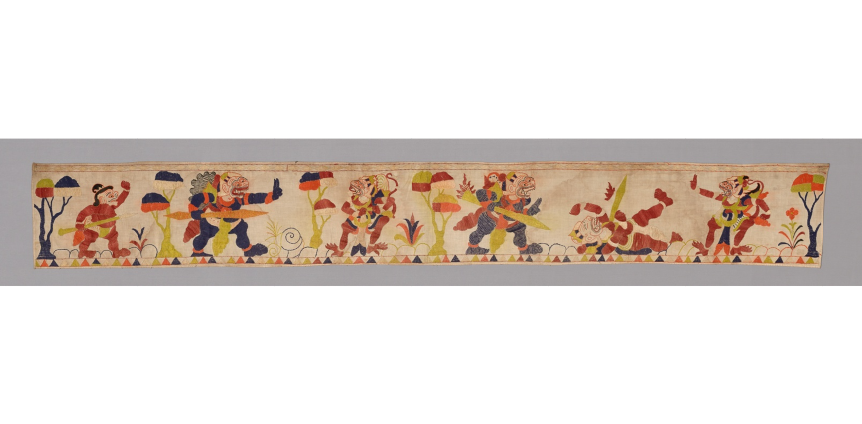
CC0 https://www.artic.edu/artworks/183415/valance
COLOR: the character of a surface that is the result of the response of vision to the wavelength of light reflected from that surface. An optical response to wavelengths of light and color through the physical understanding of hue.
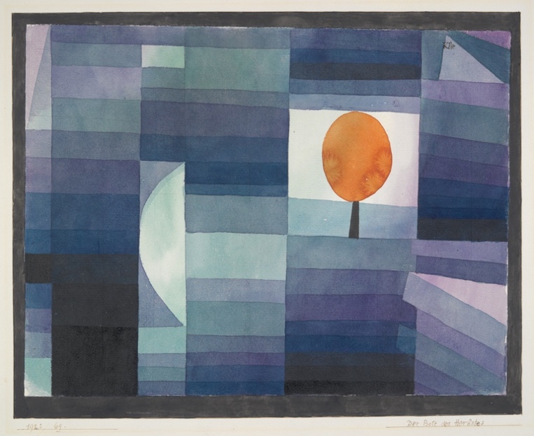
Read the definitions below and decide which or if any images match words.
ACHROMATIC: without color or hue, as in black, white, or gray.
ADDITIVE COLOR: color created by superimposing light rays. Adding together the three primary colors of light-red, blue, and green- will produce white. The secondaries are cyan, yellow, and magenta.
AFTERIMAGE: an optical phenomenon that occurs when eyes continue to perceive an image after it is no longer present.
ANALOGOUS COLORS: colors that are closely related in hue. They are usually adjacent to each other on the color wheel.
CHROMA: colors other than black, white, and gray. Chroma is the combination of color and its saturation.
CHROMATIC: the presence of color.
CHROMATIC VALUE: the value of a color.
CMYK: color reproduction for printing in which cyan, magenta, yellow, and black are layered.
COLOR CHORD: a combination of two, three, or four colors derived from a color wheel that work well together. Color combinations that are harmonious or compatible.
COLOR FIELD: an abstract style of painting focused on areas of solid color.
COLOR PERMANENCE: the ability of a color to maintain its original properties over time under normal lighting and environmental conditions. Any pigment that can be expected to last or remain without essential change is considered to have color permanence. Various color based art materials are sometimes labeled with a code indicating a color’s degree of permanence.
COLOR SCHEME: a particular combination of colors.
COLOR WHEEL: a radial design where the primary, secondary, and intermediate colors are displayed for identification.
COMPLEMENTARY COLORS: two colors, equally spaced on the color wheel, directly opposite each other.
COOL COLORS: blue, green, and violet represent cool colors on the color wheel. Cool colors can suggest calm, light, or water.
EXPRESSIVE COLOR: color chosen by an artist without regard for the natural appearance of the object portrayed. Expressive color (also known as subjective) represents the expression of the individual artist.
FAUVISM: French expressionist painters that used bold and exaggerated color in their paintings.
FOLK ART: art and craft objects made by people who have not been formally trained as artists.
GRADATION: a smooth transition from dark to light value.
HIGH KEY COLOR: value of color that is middle gray or lighter.
HIGH KEY VALUE: value that is middle gray or lighter.
HIGHLIGHT: area on a surface that reflects light.
HUE: the generic name of a color; also designates a color’s position in the spectrum or on the color wheel. Hue is determined by the specific wavelength of the color in a ray of light.
ILLUMINATION: the source of light.
IMPRESSIONISM: an art movement that focused on color and light which led to fascination of early modern painters.
INTENSITY: the saturation, strength, or purity of a hue. A vivid color is of high intensity; a dull color is of low intensity.
INTERMEDIATE COLOR: colors created when mixing a primary and secondary color, also known as tertiary color.
LOCAL COLOR: colors seen realistically or in the objective world; blue sky or green leaves.
LOCAL VALUE: whiteness or darkness as perceived in the objective world unaffected by the light falling on it.
LOW KEY COLOR: color with the value level of middle grey or darker.
LOW KEY VALUE: value with the level of middle grey or darker.
MONOCHROMATIC: having only one hue; may include the complete range of value from white (tint) to black (shade).
NEUTRALIZED COLOR: the mixture of the three primaries to establish gray or reduced color intensity.
NEUTRALS: a color adjusted with the mixture of its complement to dull its hue.
OP ART: graphic art or works focused on optical illusion that may be perceived as three dimensional illusions.
OPAQUE (or opacity): Something that cannot be seen through, not transparent.
PIGMENTS: color substances powdery in nature, that are mixed with liquid vehicles or binders to produce color media and paint.
POP ART: the 1950s movement that challenged fine art traditions and borrowed images from popular and mass culture.
PRIMARY COLOR: a preliminary hue that cannot be broken down or reduced into component colors. Primary colors are the basic hues of any color system that in theory may be used to mix all other colors.
RGB: red, green, and blue as seen in the color spectrum.
SATURATION: the intensity or purity of a color.
SECONDARY COLOR: a color produced by a mixture of two primary colors.
SHADE: a color produced by mixing black with a hue, which lowers the value level and decreases the quantity of light reflected.
SPECTRUM: a range of colors evident in a beam of light.
SPLIT COMPLEMENT: a color and the two colors on either side of its complement.
SUBTRACTIVE COLOR: the sensation of color that is produced when wavelengths of light are reflected to the viewer after all other wavelengths have been subtracted or absorbed.
TEMPERATURE: the physical and psychological heat generated by a color.
TERTIARY COLOR: color resulting from the mixture of a primary color with a secondary color. Tertiary colors are characterized by the neutralization of intensity and hue.
TETRAD: four colors, equally spaced on the color wheel, containing a primary and its complement and complementary pair of intermediates. This can also mean the organization of color on the wheel forming a rectangle that could include a double split complementary colors.
TINT: a color produced by mixing white with a hue which raises the value level and increases the quality of light reflected.
TONALITY: value or quality of color, neutralized by adding gray.
TRIAD: three colors that are equidistant on a color wheel.
VALUE: the characteristic of color determined by its lightness or darkness, or the quantity of light reflected by the color.
WARM COLORS: red, orange, and yellow imply warm on the color wheel. These colors can appear closer to the viewer. They can depict fire or intensity.
1.
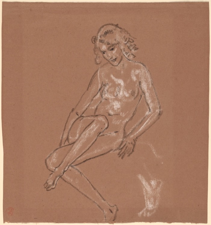
Seated Nude and a Foot, Arthur B. Davies, black and white chalk on brown laid paper, 1920. https://www.nga.gov/collection/art-object-page.56982.html
2.
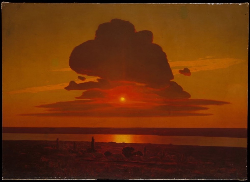
3.
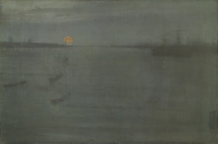
https://www.artic.edu/artworks/56905/nocturne-blue-and-gold-southampton-water
4.
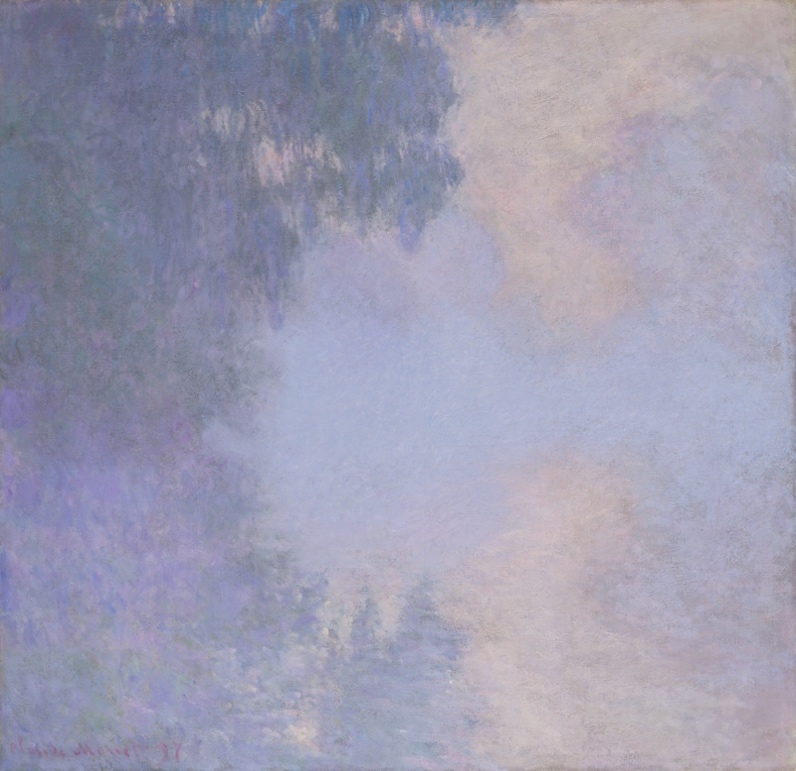
https://www.artic.edu/artworks/16564/branch-of-the-seine-near-giverny-mist
5.
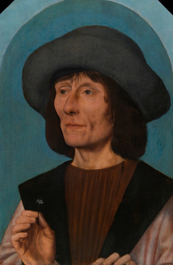
https://www.artic.edu/artworks/864/portrait-of-a-man-with-a-pink
6.
CC0
7.
CC0 https://artgallery.yale.edu/collections/objects/31435
8.
CC0 https://artgallery.yale.edu/collections/objects/38035
9.
CC0 https://artgallery.yale.edu/collections/objects/52813
10.
CC0 https://artgallery.yale.edu/collections/objects/43720
