
5 Lab 5: Environmental Justice
Introduction
Environmental justice (EJ) is one of the key sub-topics of Human-Environment Geography that addresses the (in)equitable distribution of environmental burdens and benefits. We’ve seen definitions of EJ in lecture and in the textbook. Here, we’ll see the definition used by the Environmental Protection Agency (EPA): “… the fair treatment and meaningful involvement of all peoples, regardless of race, color, origin, or income, with respect to the development, implementation, and enforcement of environmental laws, regulations, and policies.” The lack of this protection from hazards (i.e. health and/or environmental hazards) and the lack of ‘a seat at the table’ in the decision process is widespread across the world, including here in Omaha. For this lab, we will examine EJ issues spatially within the city limits and assess their prevalence in different communities.
The primary objectives for today are to:
- Become familiar with different environmental and demographic indices used to assess environmental justice prevalence.
- Analyze environmental and demographic data to determine if, and where, environmental justice is of greatest concern in the Omaha area.
- Generate and analyze numerical data and graphics to support your scientific hypothesis of geographically-focused environmental justice prevalence.
Background
Environmental Justice
There are many facets to EJ, including the subsets that seek to achieve geographic, social, procedural, and generational equity. While all are critically important topics, and a part of the overall EJ social movement, we will only be examining geographic and social equity topics here in lab today. If you’d like to see some examples of generational equity, consider reading up on the Juliana v. United States court case in California. Additional examples are provided in the textbook.
EJ Screen Mapper: EPA
To visually analyze EJ in the Omaha area, we will be using the EPA’s EJ Screen Mapper: https://ejscreen.epa.gov/mapper/. This platform is effectively an online Geographic Information System (GIS) maintained by the EPA. It allows the user to plot up various spatial datasets of environmental and demographic variables, then compare them. The platform maintains approximately a dozen different environmental hazards or indicators, complied from multiple data sources (Table 1).
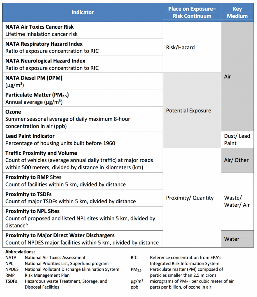
There are also a number of demographic indicators as well, such as total population, income levels, education, age, linguistic isolation (primary language other than English), race, and ethnicity, among others. All of these data (environmental and demographic) are displayed within different census tracks.
EJSCREEN Data
Data will be provided for various environmental and demographic indicators from EJSCREEN. Data are shown in terms of a percentile in either comparison to the state of Nebraska. A percentile is a measure to indicate the percentage of observation which are below a specific observation. For instance, if one particular sample was in the 90% percentile, 90% of the other observations would be below the level of the particular sample. Data have been provided, but if you’d like access to the original GIS, find it here: https://ejscreen.epa.gov/mapper/
Data Analysis with Excel
In addition to visually analyzing EJ datasets, you will also be providing basic statistical evidence to support or disprove your hypothesis of the spatial prevalence of EJ issues. You will be given access to an excel spreadsheet which contains the raw data observations of many environmental and demographic variables for all of the census tracts across the state of Nebraska. There is an additional sheet which describes the variables used. You will be making scatterplot graphs of different variables. There are multiple ways to generate these graphics. One way will be detailed below, but you are welcome to search online (Google, Youtube) for help, ask your instructor or a classmate, or figure it out for yourself. You may also import these data into something you are more familiar with if you wish, such as Google Sheets or Numbers. Excel is available on most University computer lab machines, and if FREE to all students through UNO ITS (https://www.unomaha.edu/information-technology-services/software-and-hardware/personal-hardware-and-software.php).
*These are written for MAC users, but the same general pathway works for PCs. To make a scatter plot, start by selecting your data. This will make an example of population (ACSTOTPOP) vs. Cancer rates. Highlight the entire columns of ACSTOTPOP and Cancer. Then, go up to ‘insert’ and select chart, then X-Y scatter plot. It should generate a graph that looks like Figure 1 (below). If you want to add additional data, or change the columns used, you can do such by right clicking on the graph and selecting “Select Data”. A screen should pop up. On the right of the screen, there will be areas listing ‘name’, ‘X values’ and ‘Y values’. You can replace the X or Y values by clicking the icon on the right, selecting the column you wish to replace it with, clicking the icon again, and selecting OK to make the graph.
When submitting your graph (in the assignment below) make sure you have a title, axis labels, and a trend line.
Questions
Part 1 – Geographic Equity
1. Using the Environmental Indicator map of PM 2.5, describe what the color bars in the legend (and on the map) represent physically?
2. Where in town are the highest PM2.5 levels?
3. The maximum value of PM2.5 within the Omaha area is approximately 8.07 ug/m3. Thinking back to our investigation last week, how does it compare to our observations (i.e. higher/lower/about the same)?
4. Using the Environmental Indicator “Superfund Proximity”, describe where are people in closest proximity to a superfund site?
5. What is the superfund site in Omaha for? Hint: https://www.epa.gov/superfund/
6. Find the tract that contains campus. This corresponds to a Superfund proximity of 0.14 facilities per kilometer. What percentile range for the state is this?
7. Choose two other environmental indicator maps from the list on EJSCREEN. Examine the maps and describe where the highest values are within the Omaha area.
Env. Indicator 1: ___________________________
Location of Highest Values:
Env. Indicator 2: ___________________________
Location of Highest Values:
8. Across the four variables examined (#2, 4, 7a, 7b), is there overlap between the regions exposed to higher environmental/health hazards? Where is/are those region(s)?
9. Strictly in terms of geography (location within town, development of city, etc.), and temporarily disregarding demographic factors, what is unique about these regions such that they have higher proximity to environmental hazards? Aka why do you think those regions are the more hazardous regions?
10. UNO’s campus used to be located in the North Omaha neighborhood, around 24th and Pratt St., prior to the 1930s. Compare the hazards the University is exposed to in its current location near Dodge and 66th, to those in its original location. Which has fewer (or lesser) environmental hazards?
Part 2 – Demographics
11. Switch over to the Demographic Indicators Data. Select the Low-Income Population Map. A 99th percentile ranking for Nebraska indicates that approximately 90% of the population would be classified as low income. Where are there highest percentages of low-income populations (95-100th percentile)?
12. Young children are particularly susceptible to environmental hazards. Using the ‘under age 5’ indicator, describe where the highest percentage of total population is this young-child group.
13. Looking across the city, there are likely many regions with high levels of young children. Zoom in on some of the regions along the periphery of the Omaha area. What is unique about these areas?
14. Examine the “People of Color Population” indicator. Where are the parts of town with the highest levels of this metric?
15. Examine one more demographic indicator. Describe the spatial pattern you see.
Dem. Indicator ________________________________
Spatial Pattern:
16. Are there any consistent themes within the demographics of town? What are they?
Part 3 – Hypothesis
You will be making a scatter plot depicting the relationship between one environmental and one demographic indicator of your choice. Please consult the directions noted above (“Data Analysis with Excel”).
17. Keeping in mind the locations you noted in #16 and #8, develop a general hypothesis surrounding the relationships between environmental hazards and demographics for the Omaha area. A hypothesis is similar to a prediction about the relationship the graph will depict.
18. What would your graph have to look like to support your hypothesis?
19. In Excel (or similar program), create a scatterplot, depicting the relationship between one environmental and one demographic indicator of your choice. You’ll be submitting the graph with this lab (digital or printed) separately. As a reminder, you will need to have a title, axis labels and a trend line.
20. Which variables (indicators) did you choose?
Env. _____________________Dem. __________________________
21. Explain how your graph either supports or does not support your hypothesis.
22. What needs to be done to improve the quality of life for the individuals in these areas dis-proportionally impacted by environmental hazards? (i.e. how would you fix EJ issues noted in Omaha?)
